
RouteWise
Road trip planner from A to Z
Mobile Application


Project Overview
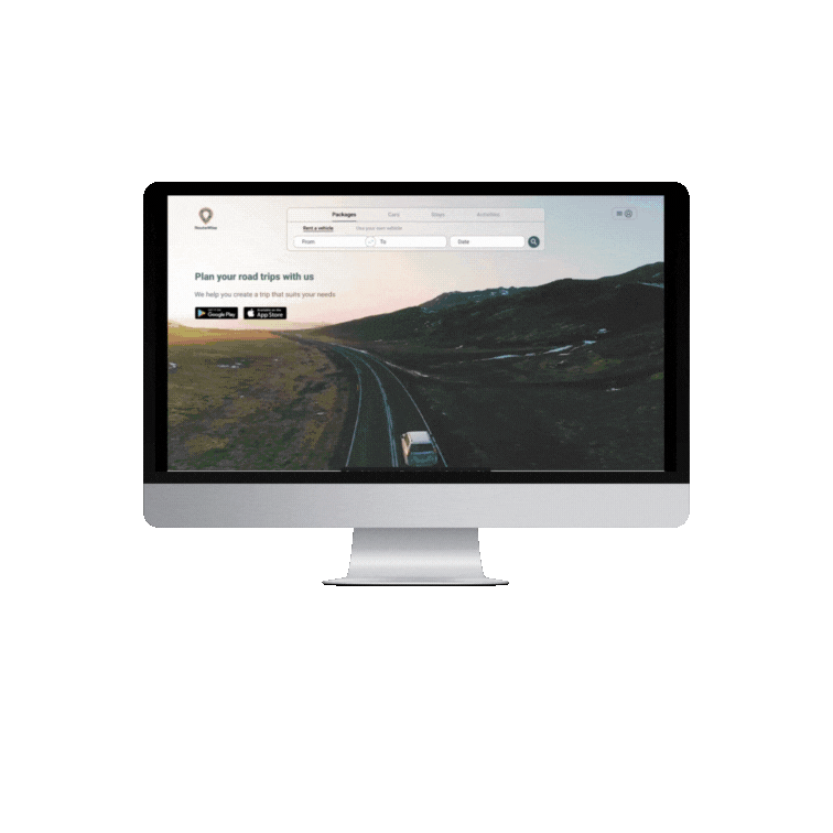

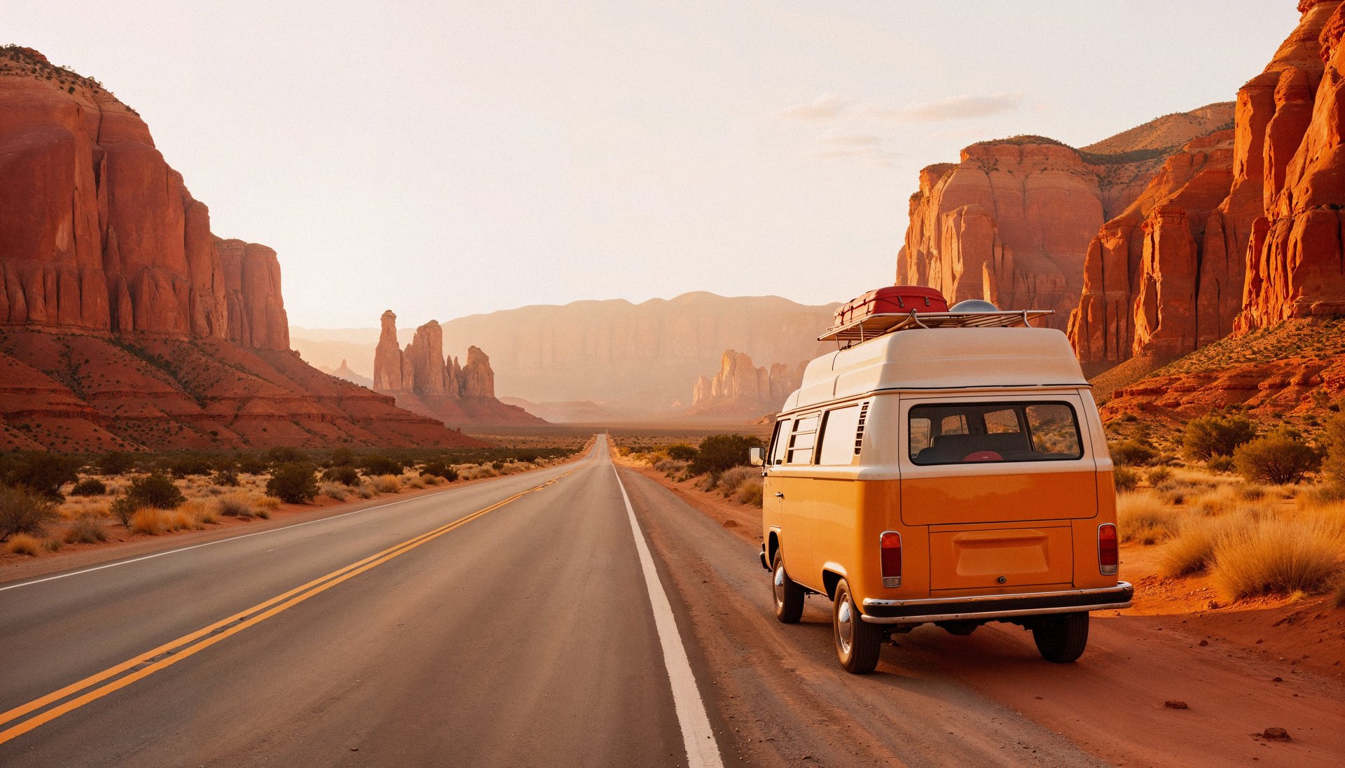
RouteWise is an all-in-one road trip planner for North America!
It simplifies route selection, vehicle choice, booking stays, and planning stops for various activities tailored to the destination, time, and budget—all with real-time cost estimates to stay within your budget.
Travelers can share the trip with others, add tripmates, and split costs with them.
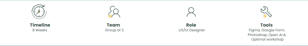

I worked on this project from scratch during a bootcamp at UX-Land School, where I collaborated as a UX/UI Designer to understand user needs and collaborated with a group to design a platform for customizing road trip plans.
Stakeholder Needs
Challenges
Easy, Simple Design for All-in-One Booking: Design a platform to encourage ongoing use for future bookings:
Streamlines route planning
Offers vehicle selection (using your own vehicle or reserving one)
Facilitates booking accommodations
Enables scheduling stops (e.g., activities, outdoor adventures, sights, and attractions)
Clear Cost Display: Present costs for each step (each reservation) and trip subtotals clearly, along with a budget-fit indicator, without overwhelming users.
Time Constraints: One of the biggest challenges in designing this project was the limited time available. Each section required separate research, which made managing the timeline difficult.
Testing Limitations: Another major challenge was the inability to test with users in real-life booking scenarios. Instead of conducting qualitative usability tests, I had to rely on lab-based testing, which limited the accuracy and reliability of our insights.


Route Planning: Provide multiple route options.
Vehicle Management: Enable users to select their vehicle or reserve one easily.
Accommodation Booking: Simplify finding and reserving stays along the route.
Activity Scheduling: Allow users to add stops for activities, outdoor adventures, and attractions.
Cost Management: Set trip budget, present clear reservation costs, and subtotals with budget comparisons.
Road Trip Enthusiasts: Individuals or groups planning road trips across North America.
Budget-Conscious Travelers: Users who prioritize managing expenses and staying within a budget.
Families and Groups: Travelers needing a streamlined platform for multi-stop trips and shared expenses.
Adventure Seekers: Users interested in exploring scenic routes, outdoor activities, and attractions.
RV and Vehicle Renters: Travelers without their own vehicle or looking to rent one for the journey.
Target Users
key Tasks
Designe Thinking
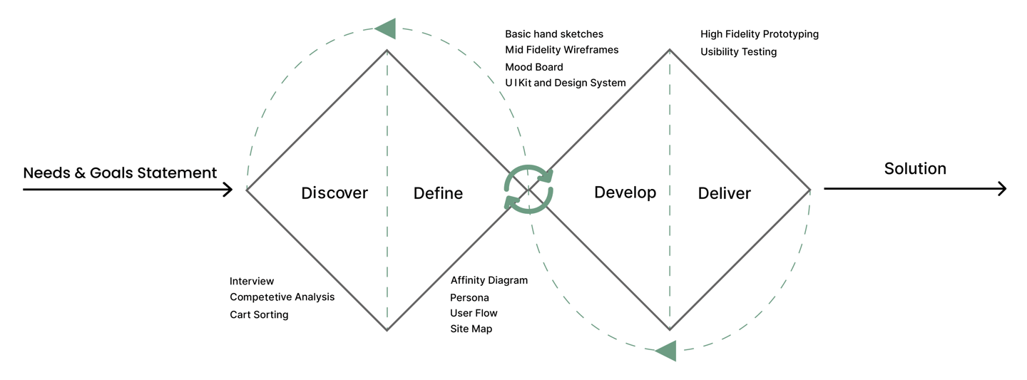
I followed a Double Diamond approach based on Design Thinking. It was not a linear path, as I moved between stages as the project evolved.
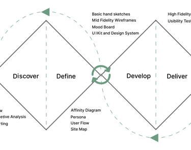
Discover
For trip planning, I focused on designing a package that includes roads, vehicles, activities, and accommodations. Each area required individual consideration, which I addressed separately during the interview process.
To understand users' pain points and develop effective solutions, I employed a comprehensive research approach using the following methods:
Interview
Competitive Analysis
Interview
I selected people who take road trips several times a year (cars/RVs) or tour leaders who manage travelers' needs. I used open-ended questions to foster discussion rather than a strict Q&A format.
I identified user pain points and expectations and discussed them with our stakeholders. Considering the business's value proposition and time constraints, I began defining the key contents for the information architecture.
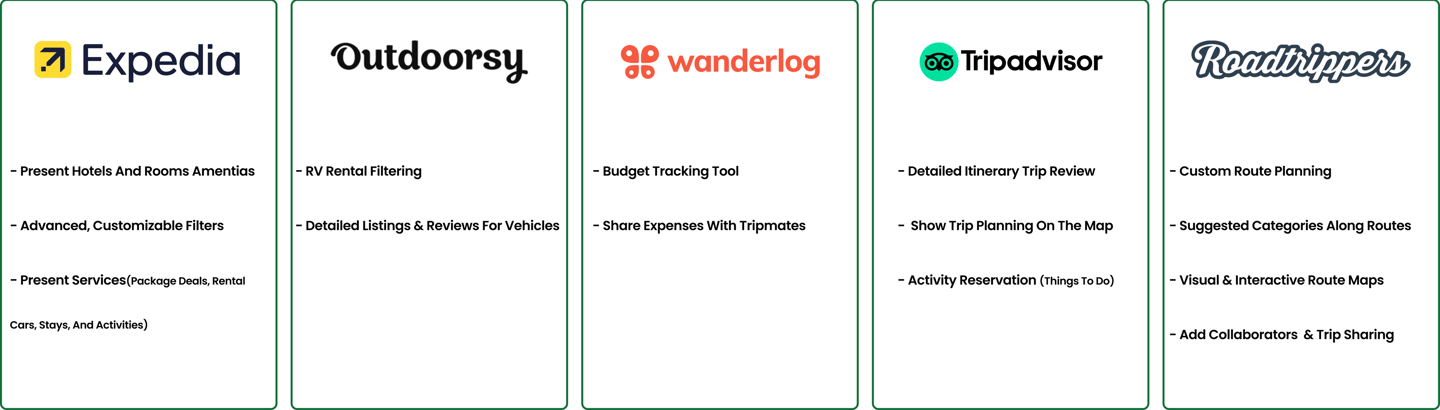
Competitive Analysis
I evaluated 12 online platforms related to road trips planning, RV/car rentals, and hotel/accommodation reservations, by examining important features based on stockholder needs. Using these features, I designed an all-in-one road trip planning that provides essential, easy-to-use tools.
Our analysis shows that Roadtrippers was the most competitive platform. However, it does not offer direct reservations for RVs, cars, or activities. So, for accommodations, I conducted a competitive analysis on Expedia, Booking.com, Airbnb, and TripAdvisor. For car and RV rentals, Outdoorsy and similar platforms were analyzed.
Below, I outlined the key aspects that influenced our design.
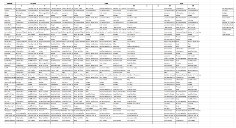
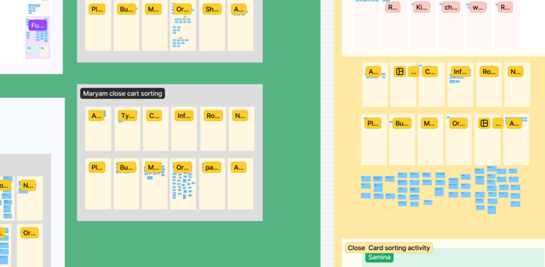
Cart Sorting
Insights from interviews directly influenced the card content. Based on the competitive analysis, I adjusted the content to improve its relevance and effectiveness.
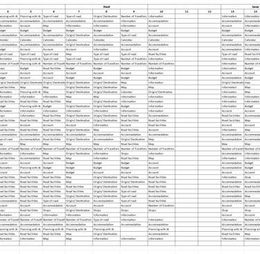
Afterward, I conducted card sorting using the Optimal Workshop and Figma (Open / Close cart sorting) .
Later, I used Excel to compare the results and identify key categories.
Over time, I made further iterations by consulting stakeholders and conducting usability tests.

Define
Affinity Diagram
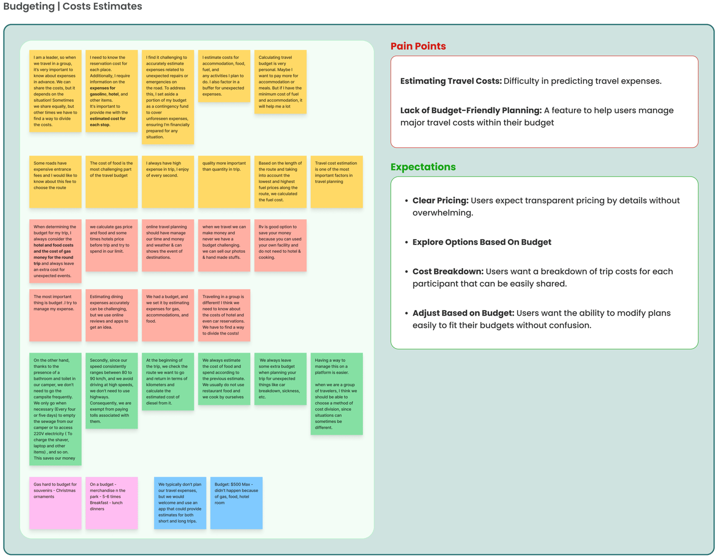
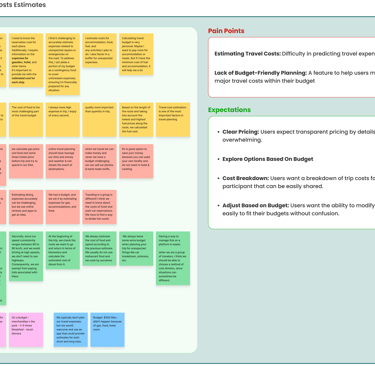
Based on Insights from the interviews, I created an Affinity Diagram and identified pain points and expectations for each key step.
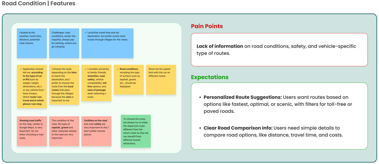
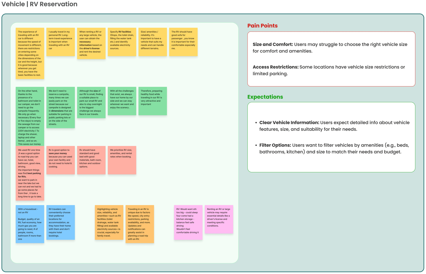
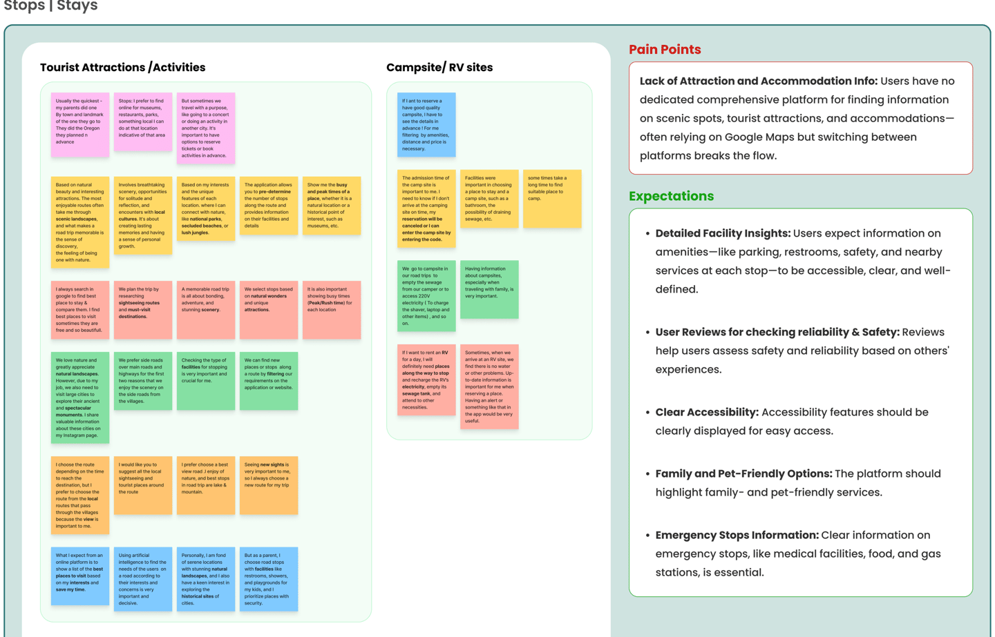
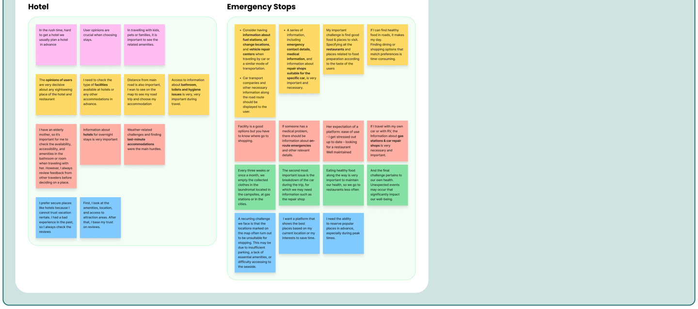
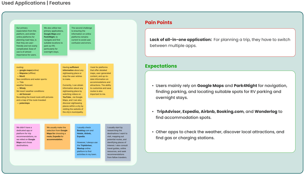
Our chosen persona represents users who value time management, budgeting, and organized planning. The users I interviewed are eager for road trips but avoid them due to limited time. They need a comprehensive platform to meet all their travel needs in one place, helping them manage both time and money while planning a memorable road trip.
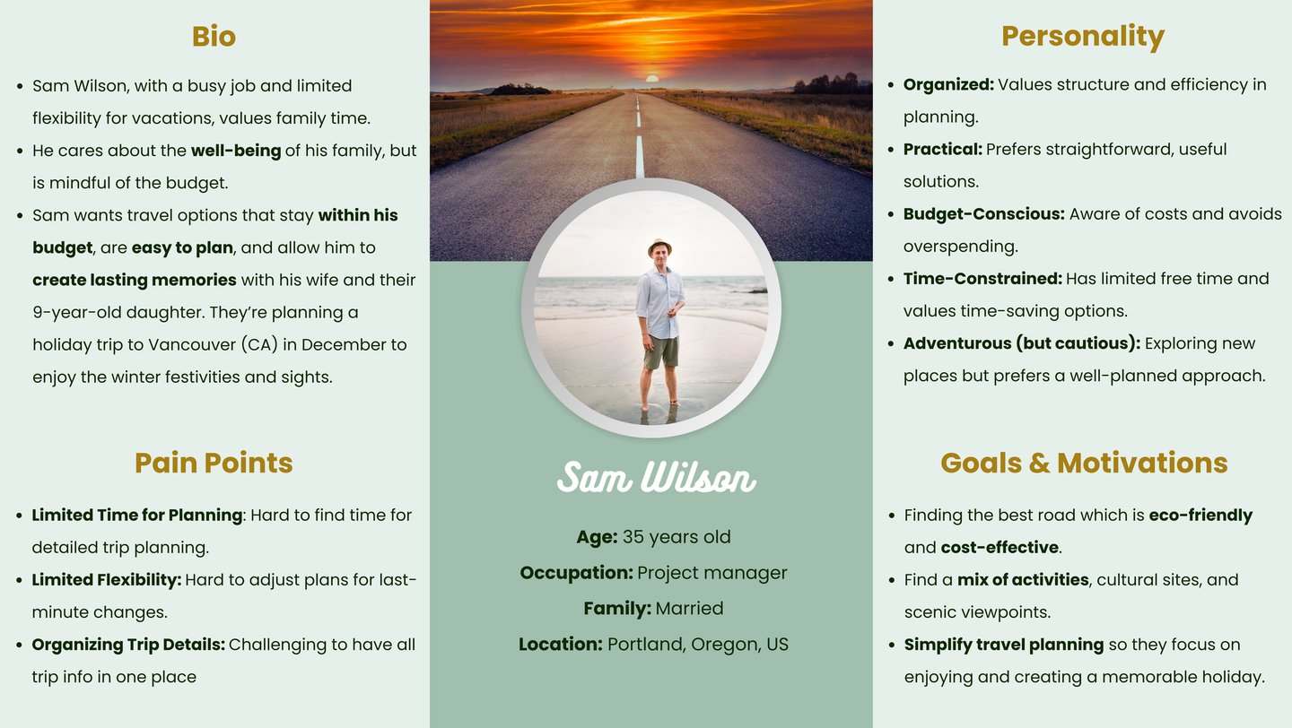
Persona
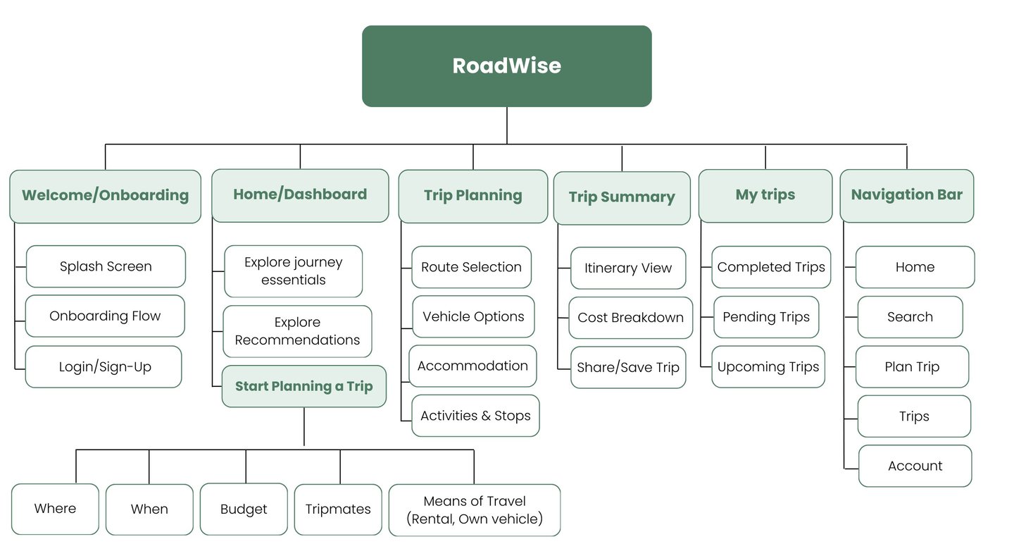
Site Map
To ensure our information architecture meets user expectations, I conducted open/ close card sorting using the Optimal Workshop & Figma. After the initial exercise, I developed our first version and iteratively refined it based on user testing and competitive analysis.
Here is our final site map:
I added a customization task to the user flow for personalized packages, providing a seamless experience for busy professionals like Sam.
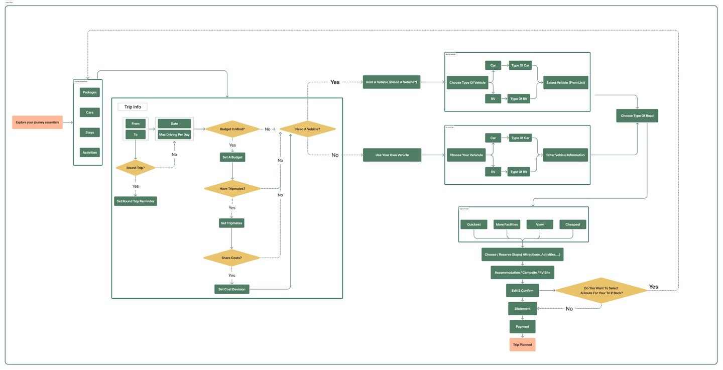
Final User Flow
Develop
After analyzing all of our research, we began to understand our project’s needs and challenges and tried to find a solution in our design.
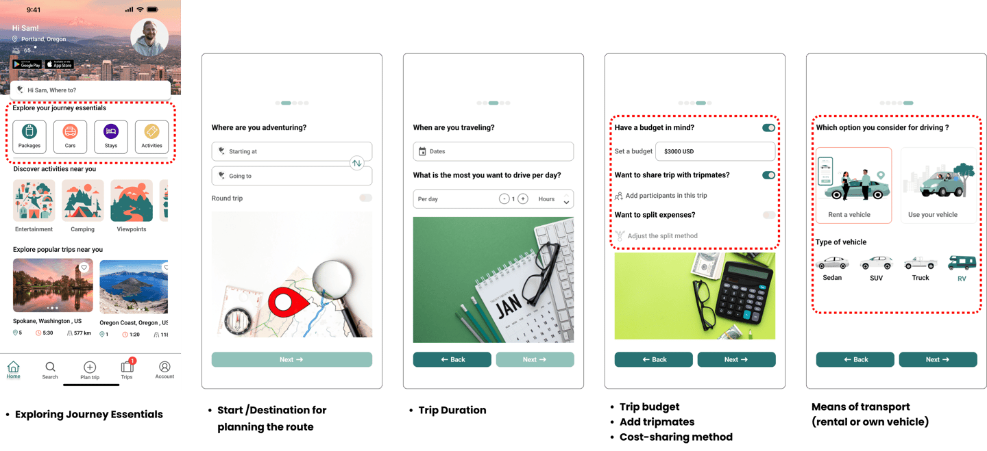
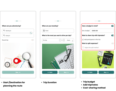
Easy, straightforward flow to gather essential information to start planning their trips.
Clear details on route & Pricing without overwhelming:
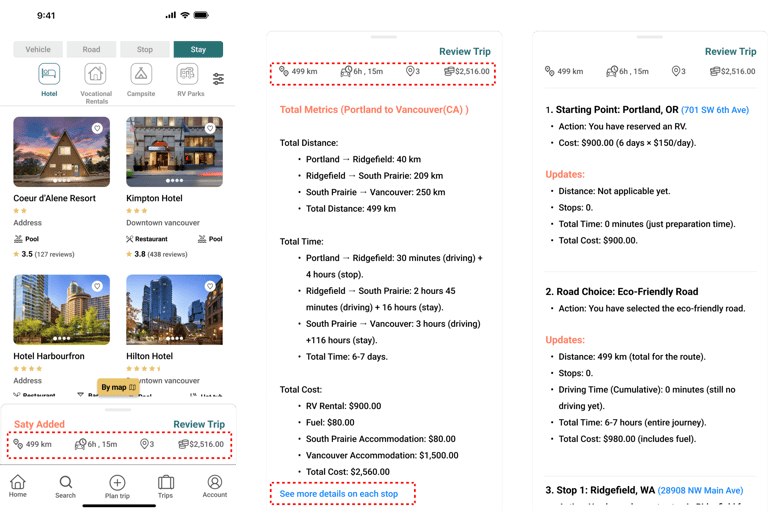
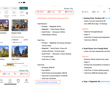
Easily plan road trips with smooth intuitive navigation, select favorites and spots based on needs through accessible, comprehensive filtering.
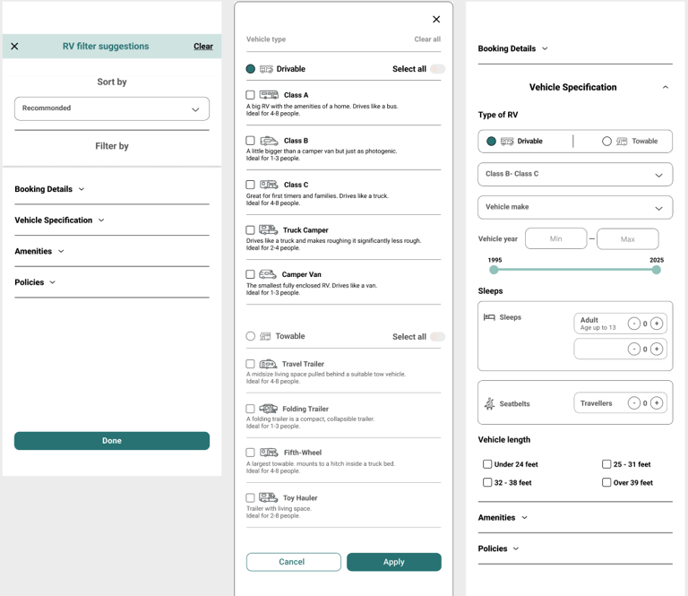
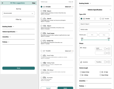
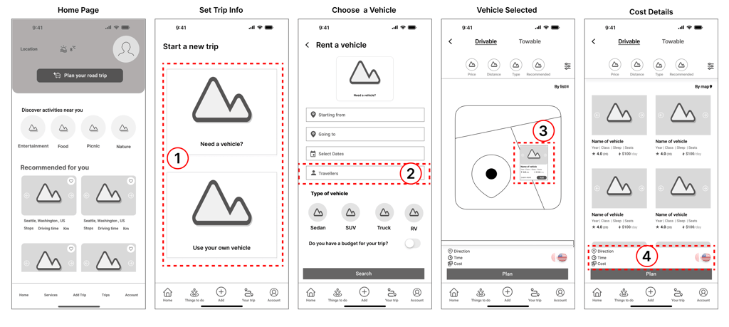
Iterations- Step 1
Sketches and Wireframes
I started with hand-sketched low-fidelity wireframes to facilitate team communication during the early design stages. Later, I used Figma to create mid-fidelity wireframes, visualizing page layouts and design direction for stakeholders.
These wireframes show a part of my design that went through multiple iterations. After finalizing the layout, I moved on to the high-fidelity design for the rest of the project.

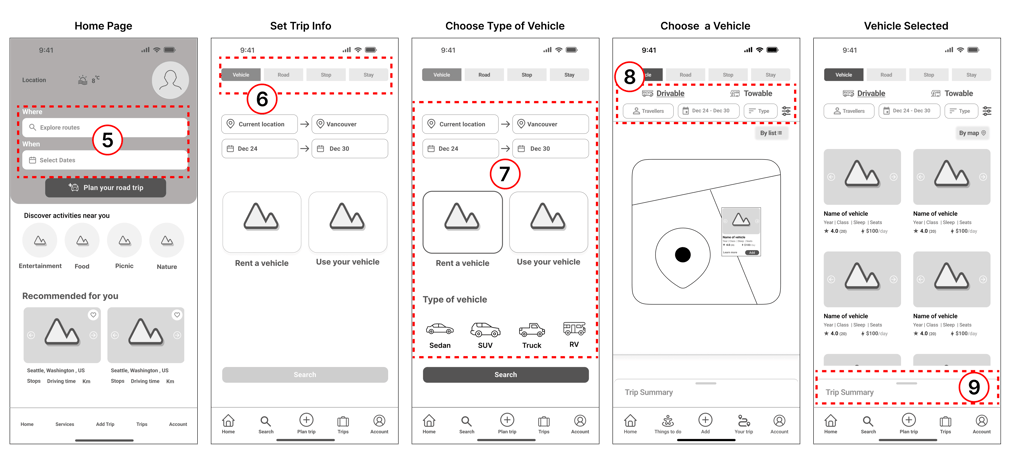


Iterations- Step 2
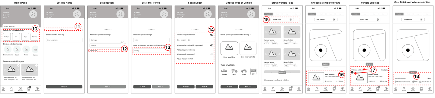
Iterations- Step 3
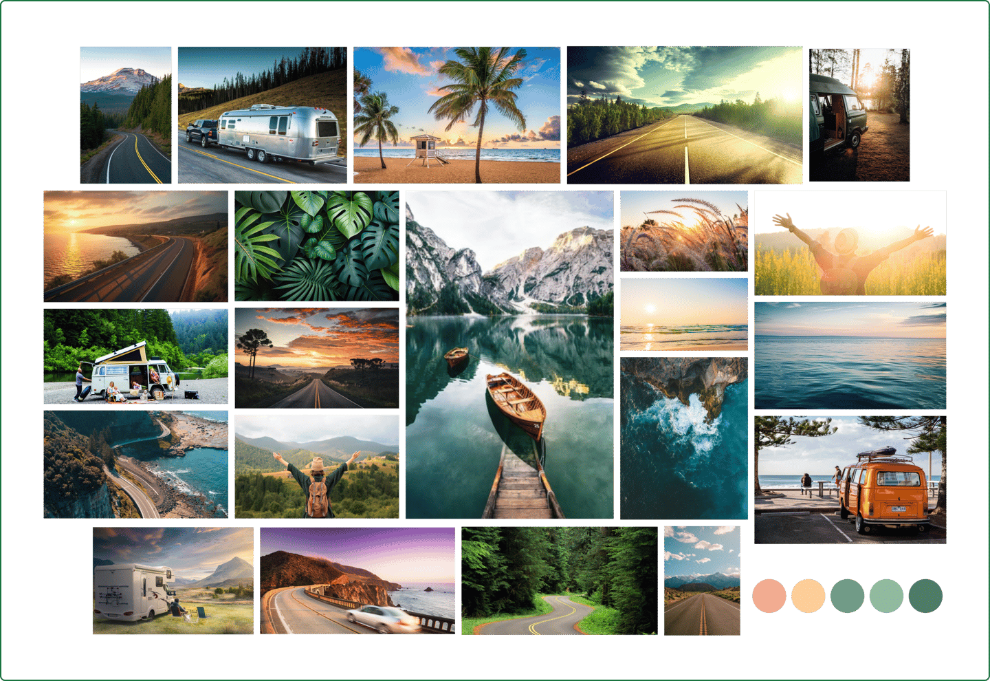
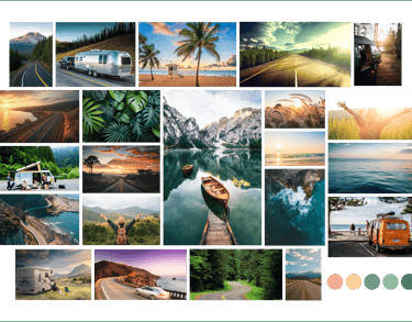
I shaped our mood board inspired by nature, ultimately arriving at a color palette that includes a variety of green shades symbolizing nature and vitality, along with cream tones inspired by the sunrise.
Moodboard
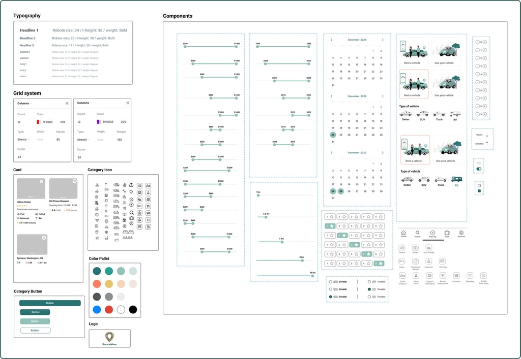
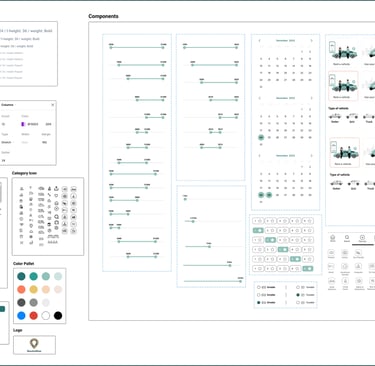
UI Kit
We developed a complete UI kit to serve as a reference for templates and components. This kit ensures that interface development is smooth, consistent, and efficient throughout the project.
Our UI kit balances casualness with a color palette of dark & light green, light orange & brown tones, modern and easy-to-read fonts.
Deliver
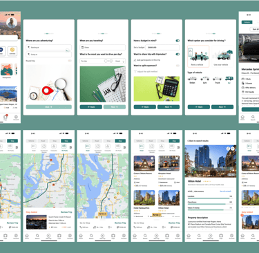
High Fidelity Wireframe
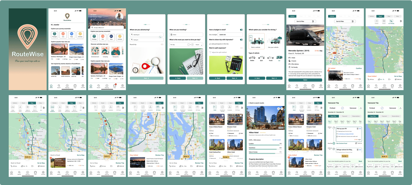
Protoype
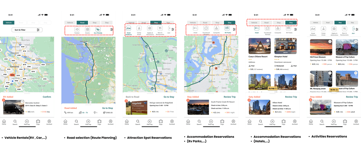
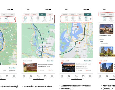
Here is the last prototype, displaying what I've achieved through our design process.
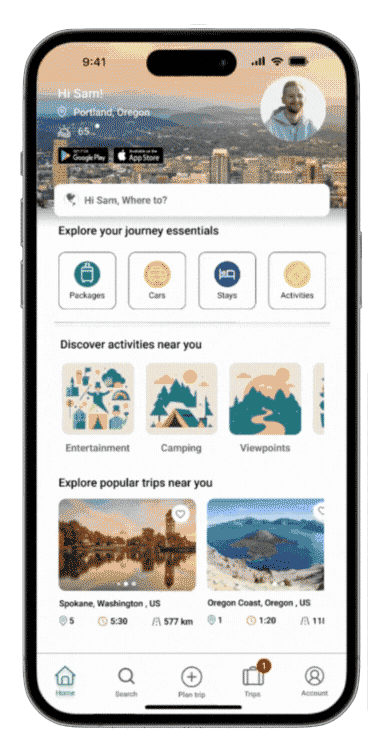
After many iterations, this represents a portion of the current high-fidelity design.

