


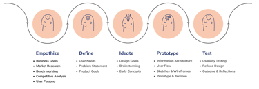
Designing a C2C home service platform that connects homeowners with verified providers. The experience supports users throughout the service journey from comparing options, to submitting requests, to tracking and managing projects, all within a streamlined interface focused on ease of use and service transparency.

Product Goals
Simplify how users discover, compare, and hire professionals
Help homeowners book reliable service providers quickly and confidently
Provide upfront pricing and time estimates to reduce decision friction
Support both on-demand and scheduled services across categories
Centralize communication, booking, payments, and project updates in one platform
Build long term trust and retention through transparency and consistency
Case Study Focus
This case study focuses on the homeowner side of the platform, those looking to request home services. However, throughout the research and design process, we also considered the needs of service providers to ensure a well-balanced experience that connects both sides of the platform effectively.

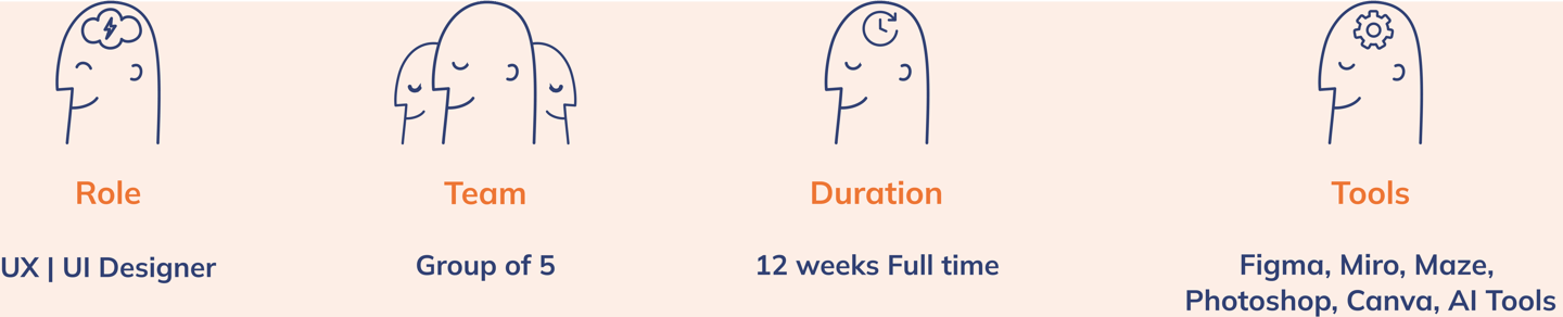
My Role
I worked as a UX/UI Designer in a 5-member team, collaborating with other groups and mentors to design a customizable home service platform based on user needs.

Our Task
While the broader platform supports a wide range of home services, our task focuses on designing the experience for a homeowner requesting electrical wiring service for a brand new residential building. The goal was to define a clear flow that captures essential project details and enables the homeowner to confidently select the right provider.
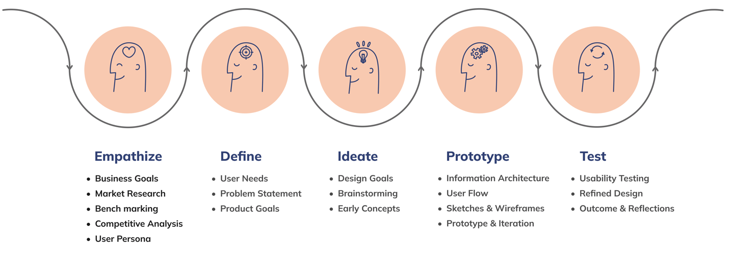

Market Research
Since we were designing the platform from scratch, we needed to analyze priority features from similar businesses to gain a clear understanding of how they structure their service flow. In other words, we wanted to explore how different businesses with different goals approached their designs to achieve those goals. Identifying patterns and common strategies helped inform our direction.
Benchmarking
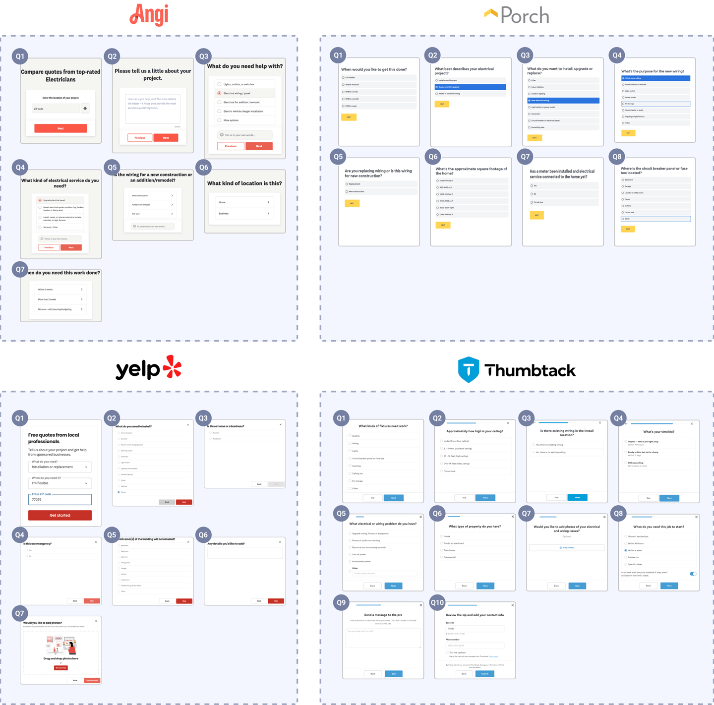
We analyzed two leading home service platforms, Angi and Thumbtack, to identify usability gaps & pain points. To align with our case study task, we asked 5 users to complete the same service request flow on both platforms. We observed their actions and gathered real-time feedback as they were encouraged to think aloud and share any confusion, hesitation, or frustration they experienced.
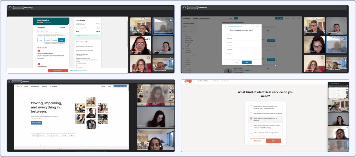
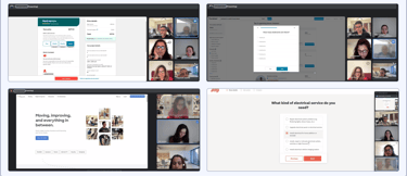
During the benchmarking sessions. we asked unscripted follow-up questions based on their responses, which helped us capture authentic user perspectives and uncover usability gaps early in the process.

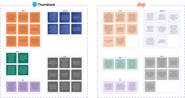
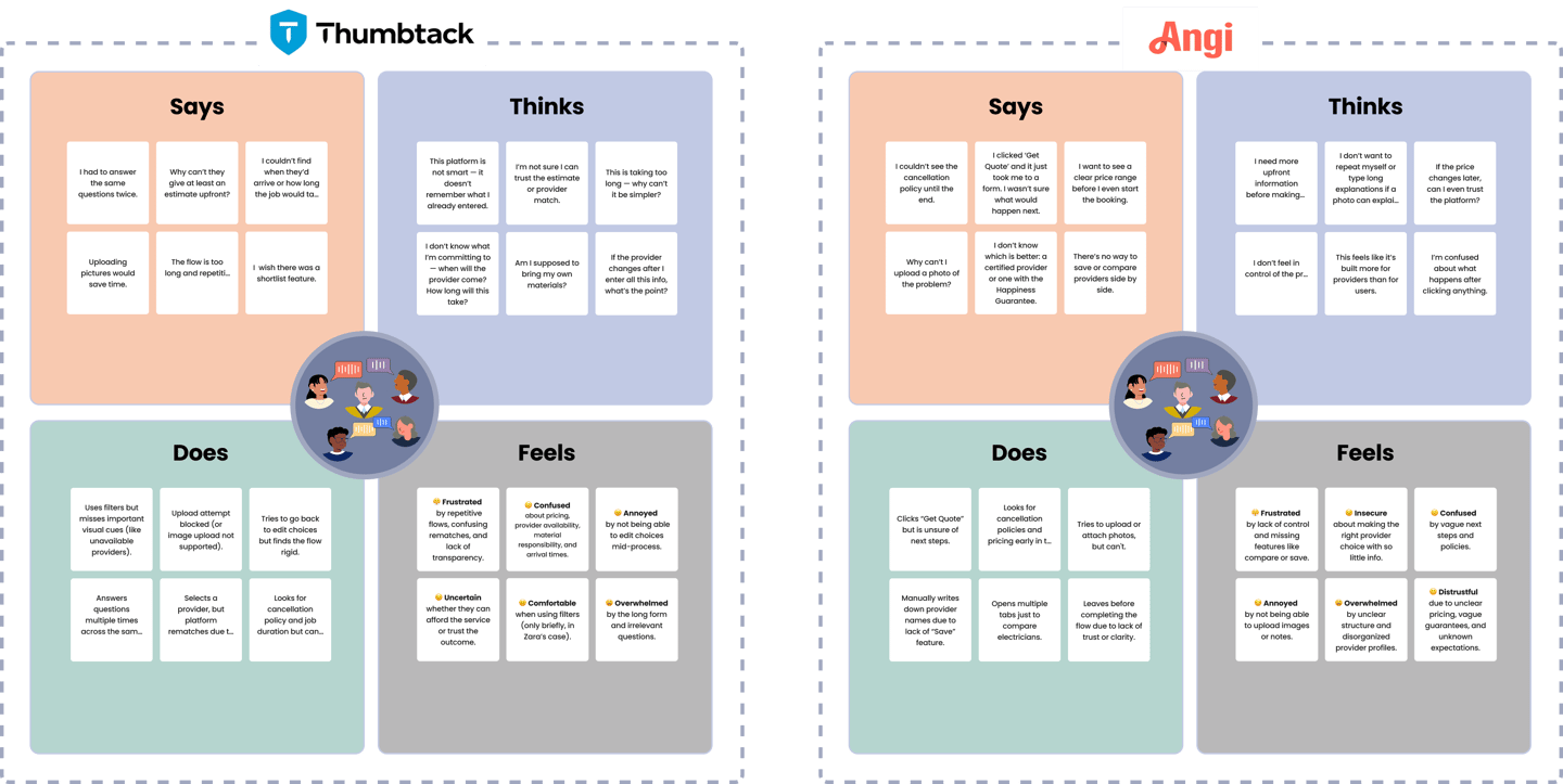
Empathy Mapping from Benchmarking
Turning Empathy into Action
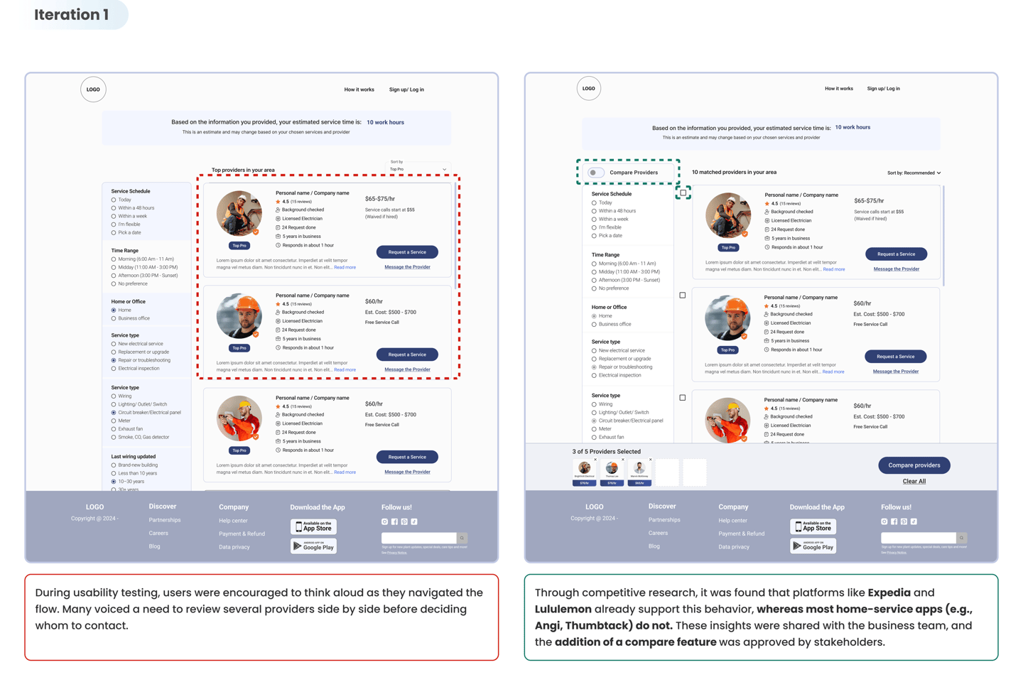
Through user feedback and behavioral analysis, we uncovered key pain points in the service selection and booking journey. These UX opportunities shaped the direction of our design solution:
Effective and Predictable Filters : Help users narrow down results accurately without surprises.
Adaptive Booking Flow: Streamline questions, avoid repetition, and respond to user input.
Transparent Pricing & Timing: Show cost estimates, discounts, and arrival windows early.
Visual Communication Tools: Allow users to upload photos/videos to describe their issue clearly.
Better Provider Comparison: Enable saving, shortlisting, & side by side comparisons for confident decision making
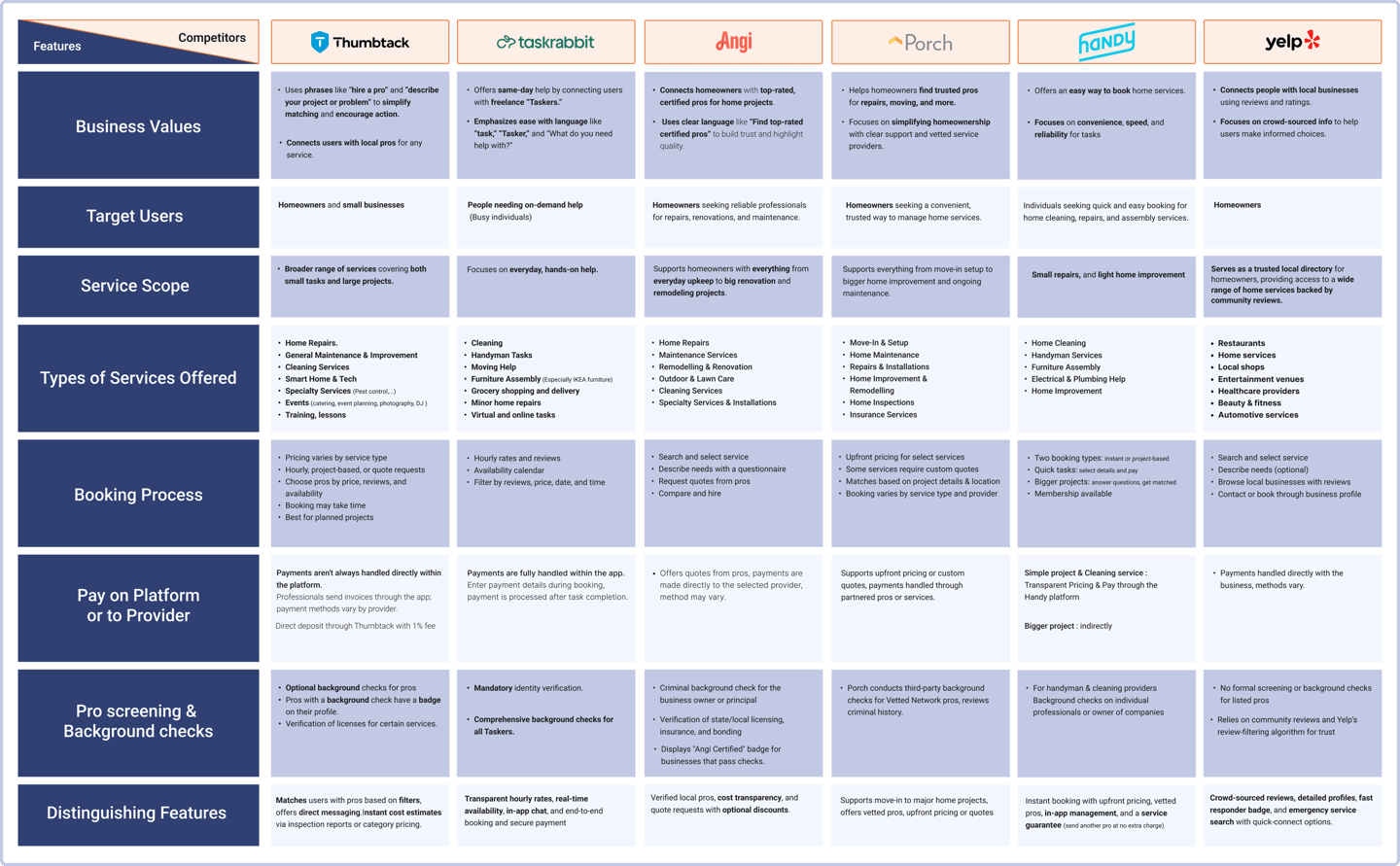
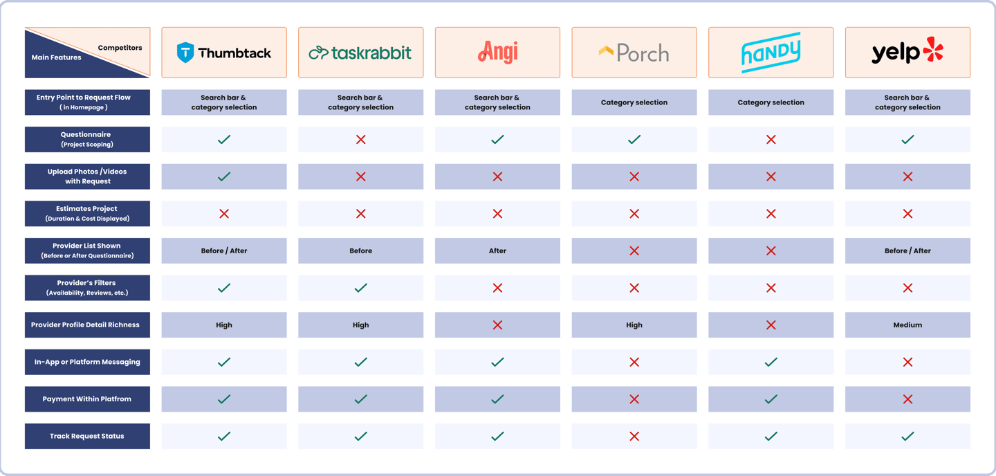
Competitive Analysis
1. Features Comparison
Based on the results we got from benchmarking, we conducted a competitive analysis of major home service platforms including Angi and Thumbtack, as well as Handy, Porch, TaskRabbit, and Yelp. This allowed us to examine how each platform structures its service request flow, presents provider information, and supports user decision-making. By identifying shared patterns and feature gaps, we defined key priorities for our own platform. These insights directly shaped the first version of our sitemap and information architecture.
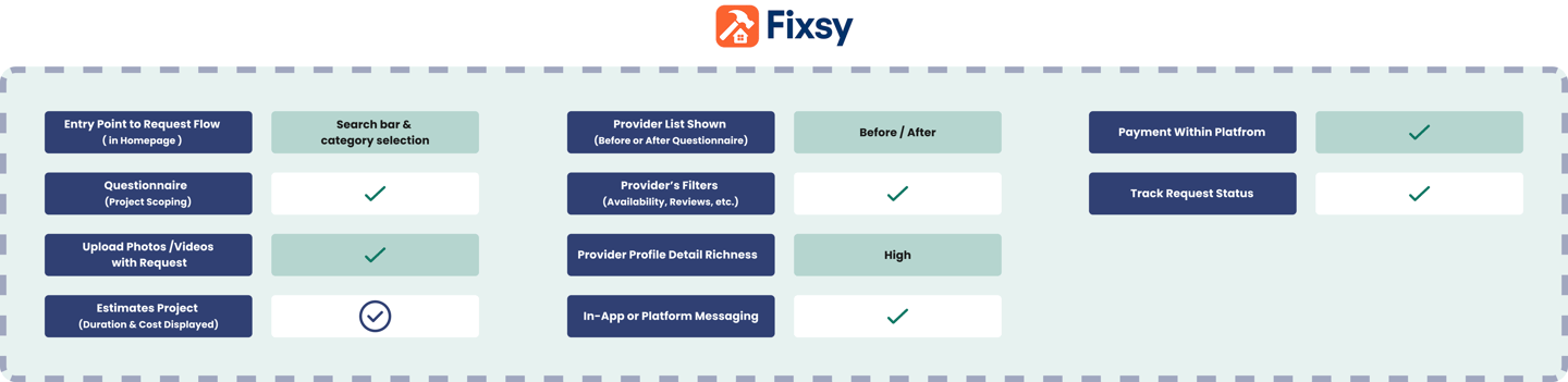
Fixsy Features
Based on insights from competitor platforms and Fixsy’s value proposition, here is the proposed Fixsy Features.
2. Questionnaire
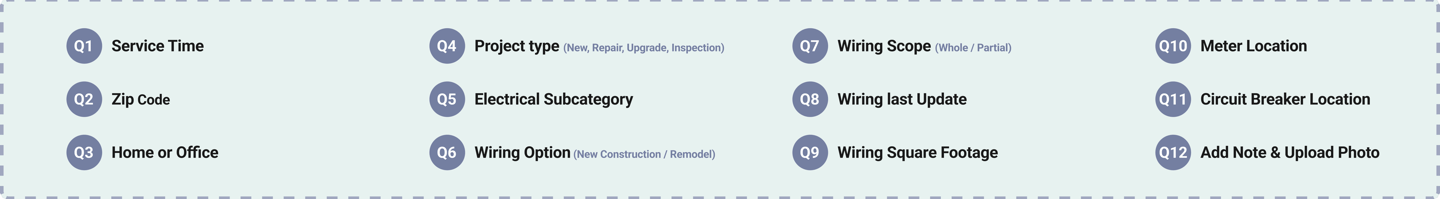
Through competitive analysis of the Flow Steps , we found that Angi, Thumbtack, Porch, and Yelp use pre-request questionnaires, while TaskRabbit and Handy do not. These questionnaires help platforms collect project details before connecting users with providers, influencing how matches are made. We shared the questions from each platform with three service providers and asked them to identify which questions help them understand the scope and scale of a project. This helped us learn which questions providers find most useful when reviewing new requests.
Fixsy Questionnaire
Using insights from service providers, we created the first version of the Fixsy questionnaire, focusing on the questions they found most helpful for understanding project scope and making informed decisions.
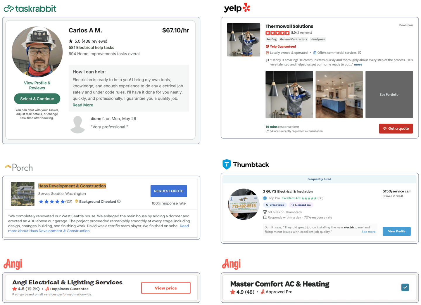
3. Pro’s Card
We reviewed provider cards from Angi, Thumbtack, Porch, Yelp, TaskRabbit, and Handy, and conducted a competitive analysis of the content displayed on each provider’s card.
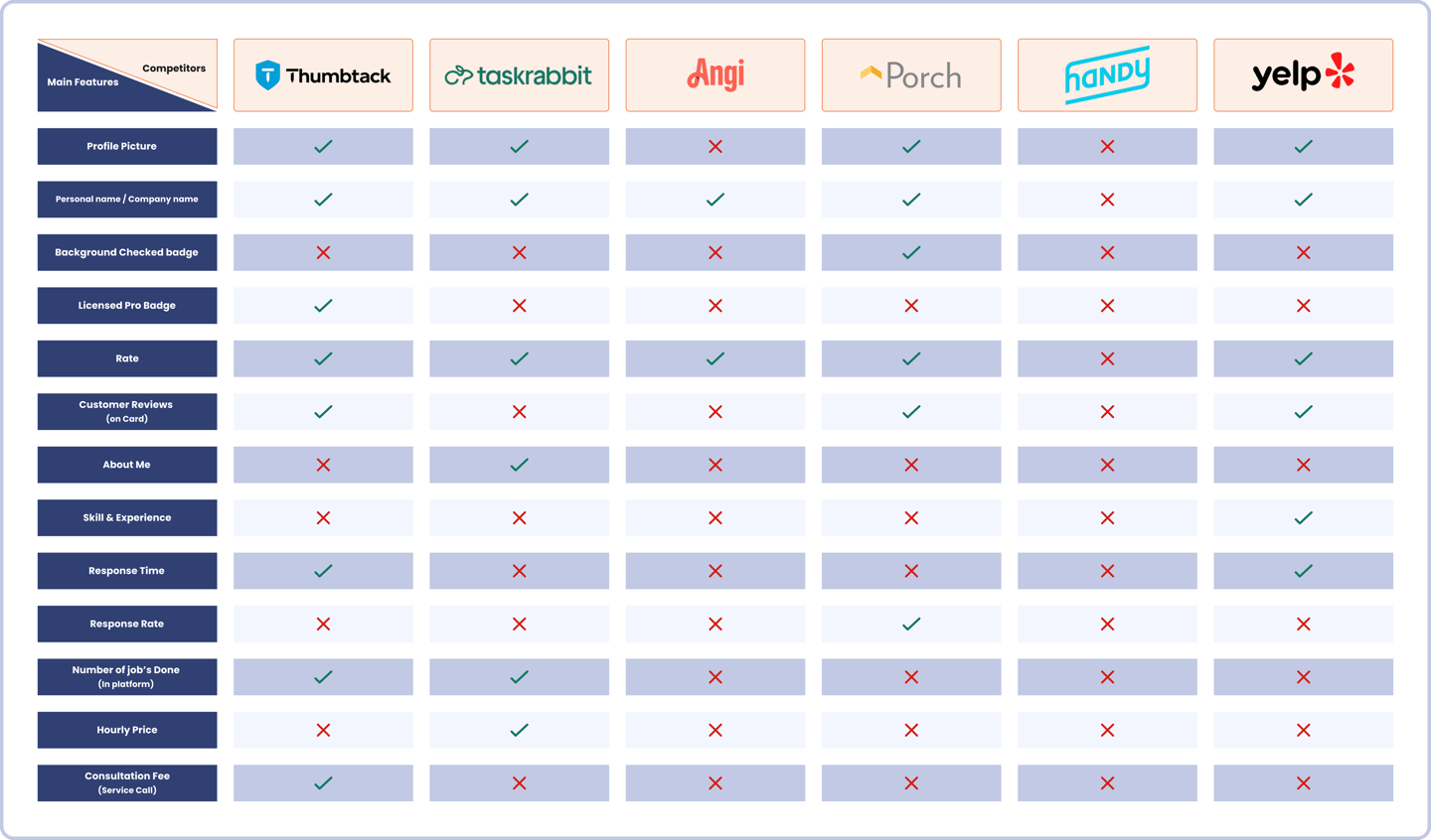

Provider Card Benchmarking
We then shared these provider card examples with 15 users and asked them to observe the cards carefully, focusing on the information presented on each one.
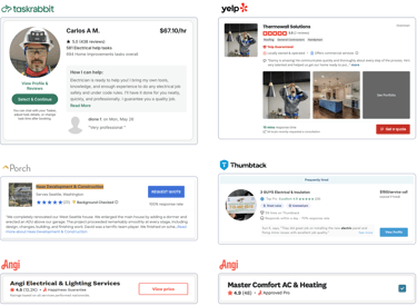
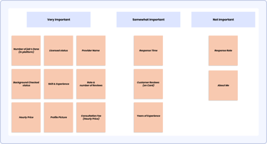
Card Sorting: Prioritizing Provider Info
We created 14 Content elements from provider cards, based on information gathered from competitor platforms. We then asked users to select the elements that gave them the most peace of mind and helped them make confident decisions when choosing a provider.
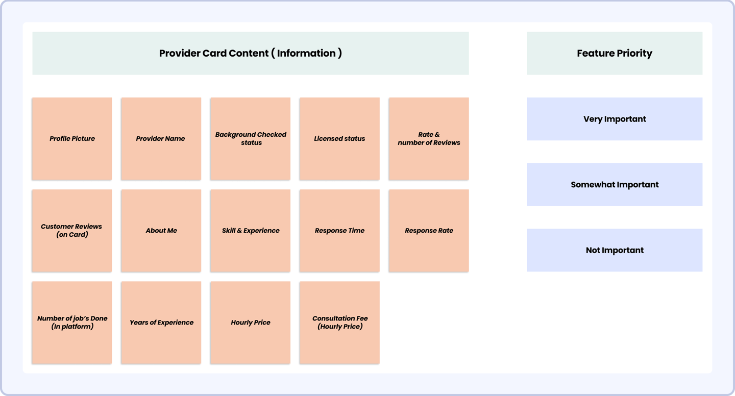

This image shows the results of a card sorting activity based on users’ prioritization of provider card elements. We used these insights to create the first version of Fixsy’s provider cards.
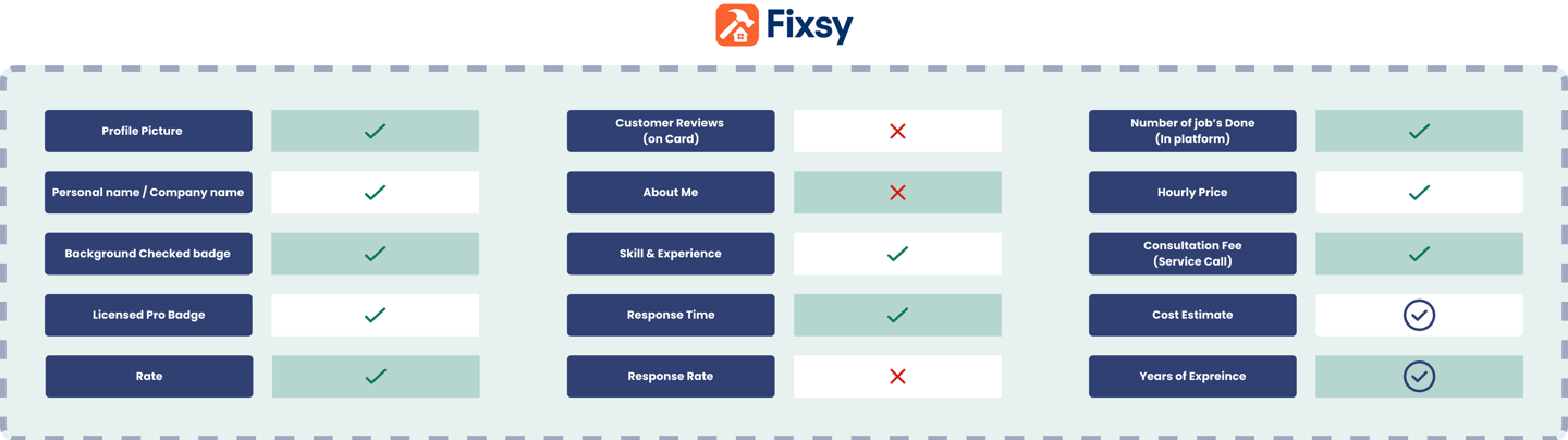
Fixsy Pro’s Card
Based on insights from competitor platforms, benchmarking provider cards, card sorting with users, and Fixsy’s value proposition, the provider card content was created.
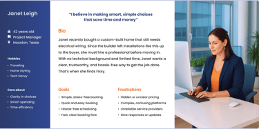
Persona
Based on insights gathered from our user research, we created a persona to represent common behaviors, needs, and pain points observed across participants..


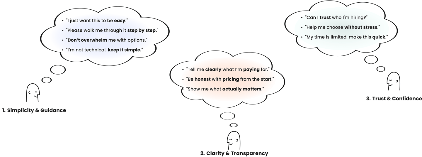
User Stories
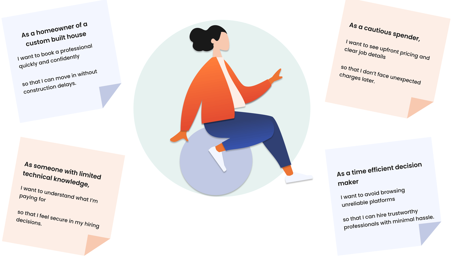
Problem Statement
Homeowners with limited technical knowledge, like Janet, struggle to find trustworthy service providers due to unclear pricing, confusing booking processes, and limited guidance during decision-making. Existing platforms often leave users uncertain about who to hire, what they’ll pay, or how long a job will take. There is a need for a simpler, more transparent experience that builds confidence and reduces effort from start to finish.

Design Goals

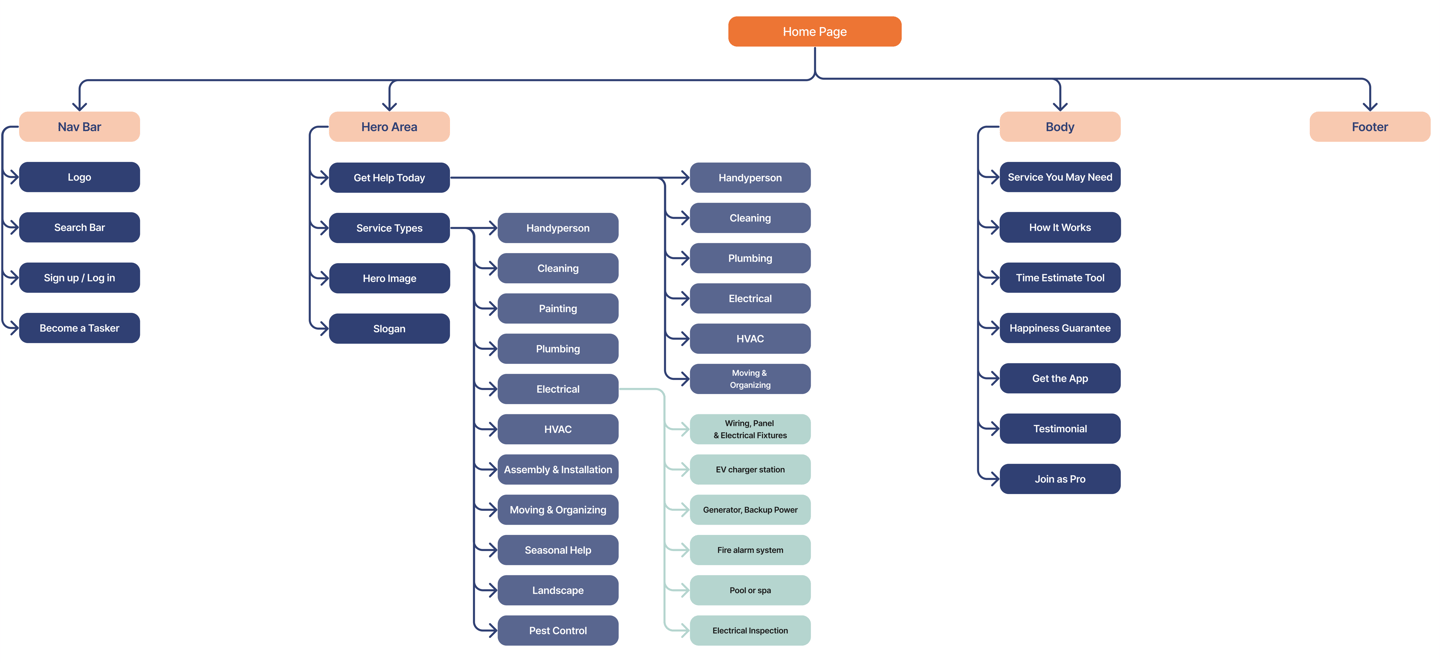
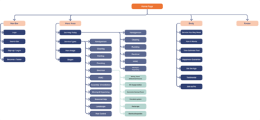
Site Map
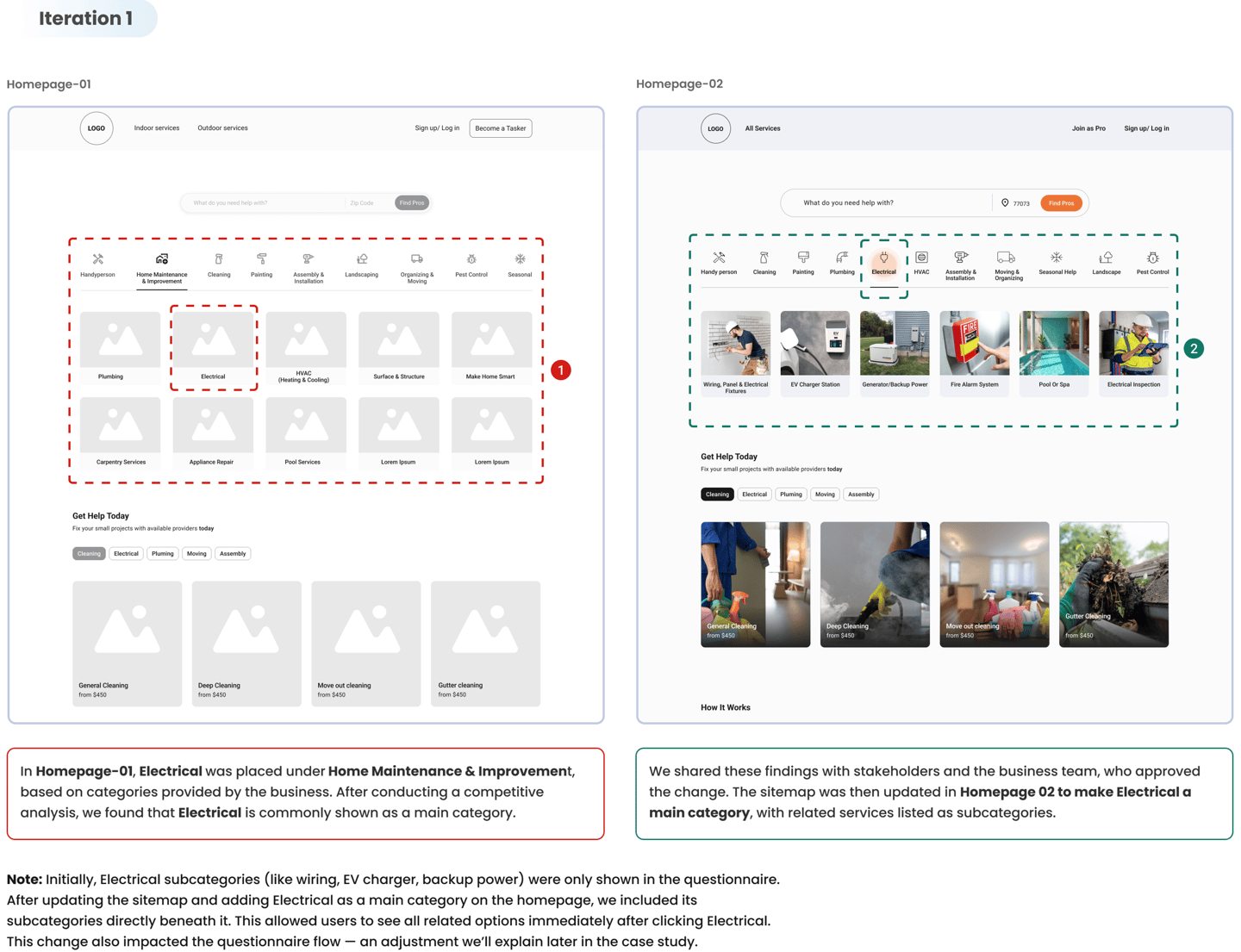
We started by creating the first version of the homepage sitemap based on competitive analysis & the service categories provided by stakeholders. After incorporating insights from our research and refining the structure through several iterations, we arrived at the final version of the sitemap shown below.
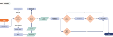
User Flow (Final Version)

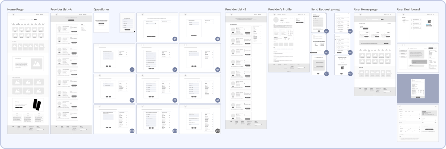
Wireframes
We created Mid-fidelity wireframes on Figma to gather feedback, and iterate on designs before moving on to more detailed and refined stages of the design process.

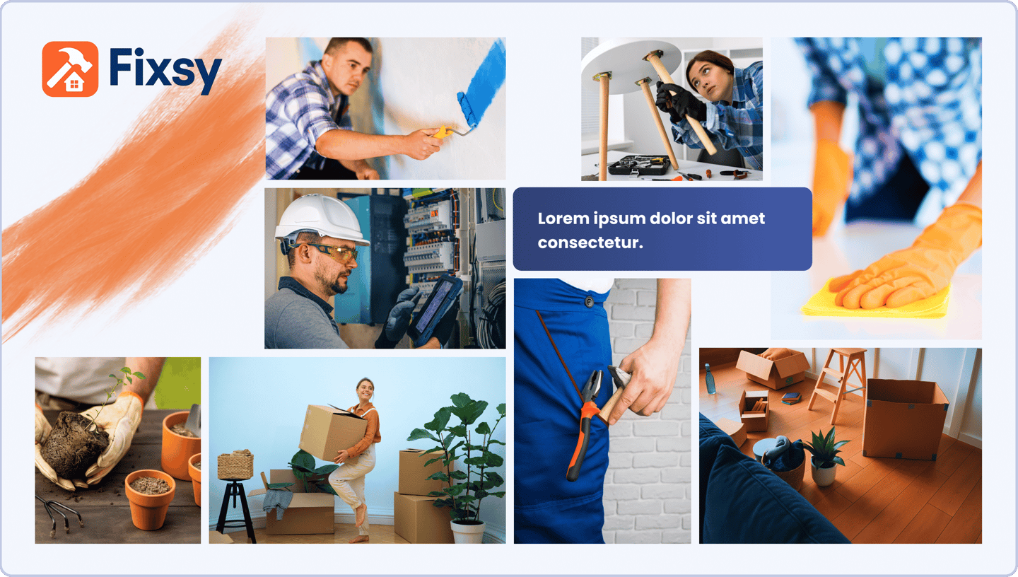
Mood board
We created this mood board based on our vision for Fixsy as a friendly, reliable home service platform. The color palette combines trust-building blues with warm, energetic oranges to reflect both professionalism & approachability.

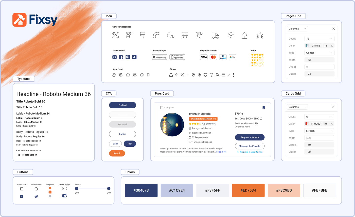
UI kit

Developer Ready Design Alignment
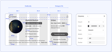
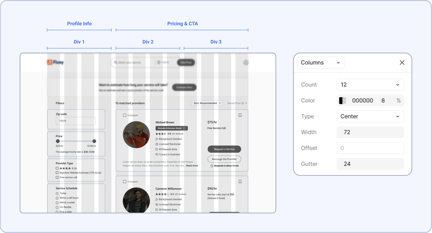
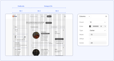
To streamline collaboration with the development team, we organized each screen into three main vertical sections (left, center, right) and applied consistent column grids—using 6 columns for components like provider cards and 12 columns for full-page layouts. We also followed an 8pt spacing system for both vertical and horizontal padding.

Prototype & Iteration
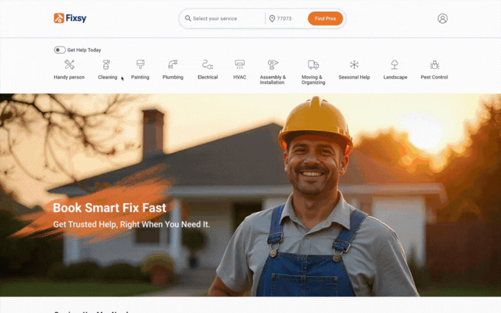
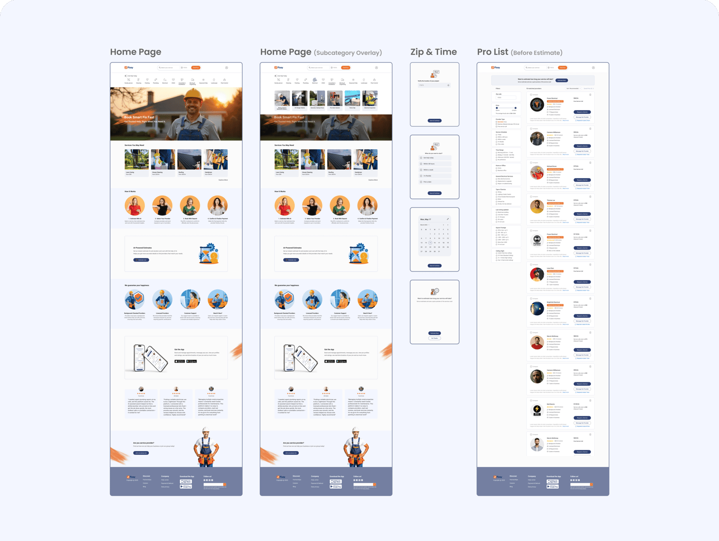
1. Home Page
We started by creating the first version of the homepage sitemap based on competitive analysis & the service categories provided by stakeholders.
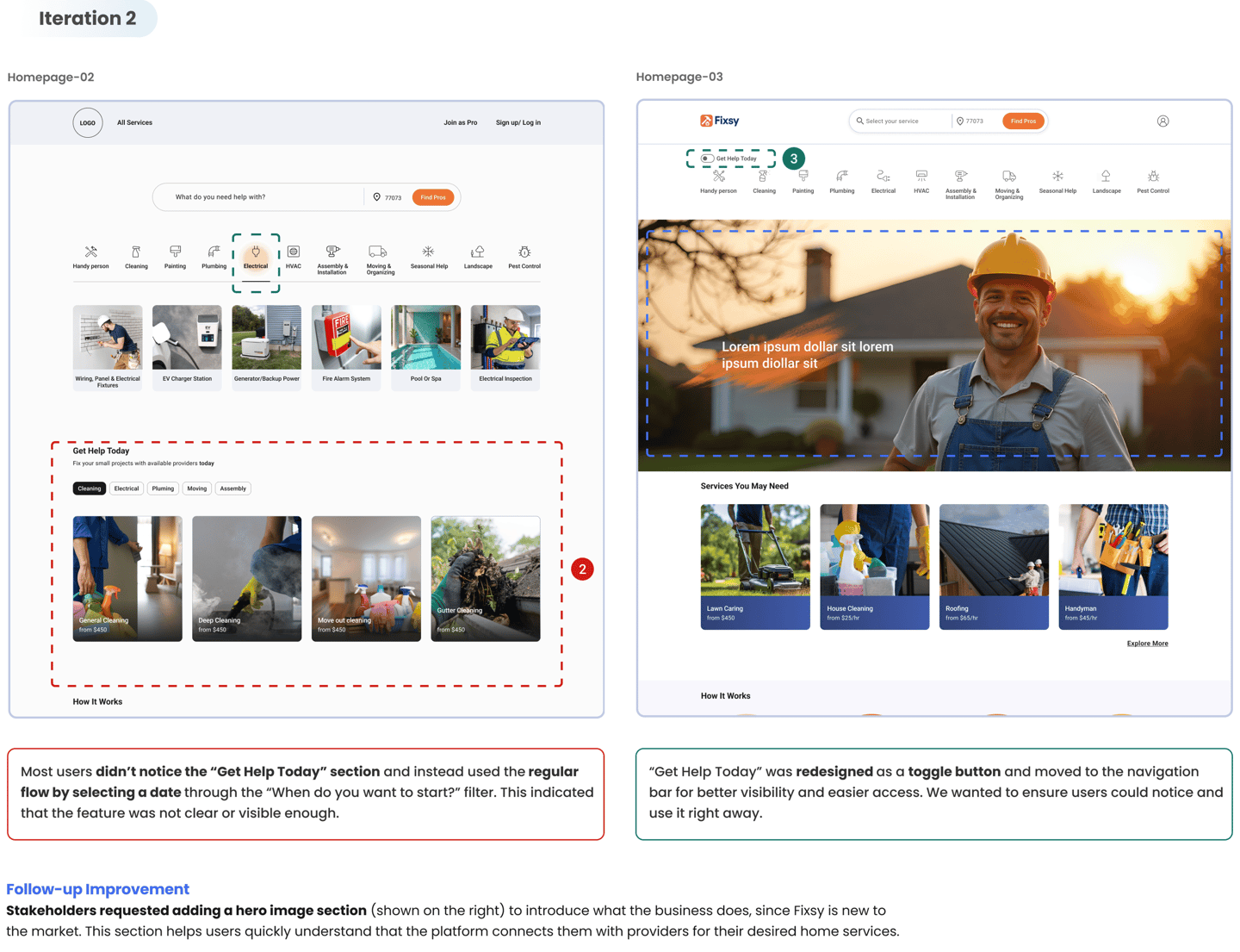
Testing the Visibility of “Get Help Today”
Since “Get Help Today” is one of Fixsy’s key value propositions, we tested it with 5 users to see if they would recognize this option and use the feature to request a service for the same day.

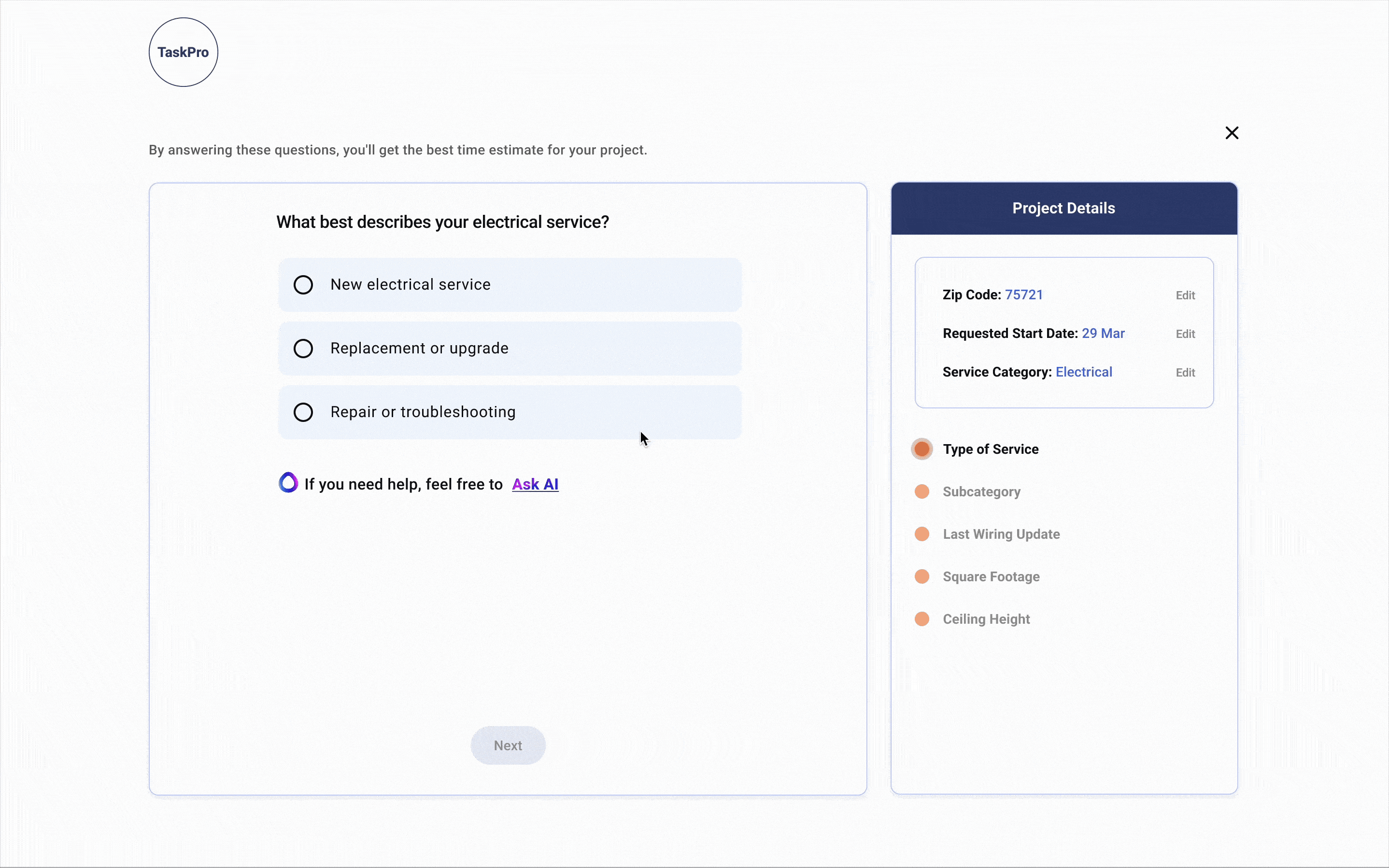
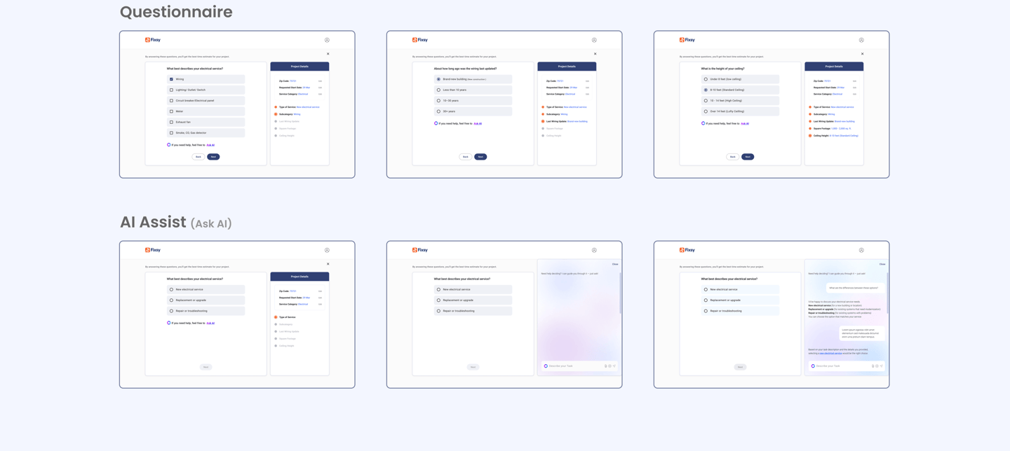
2. Questionnaire – Version 1 (Initial Draft)
Based on our competitive analysis and provider feedback, here is the first version of Fixsy’s questionnaire prepared for usability testing.
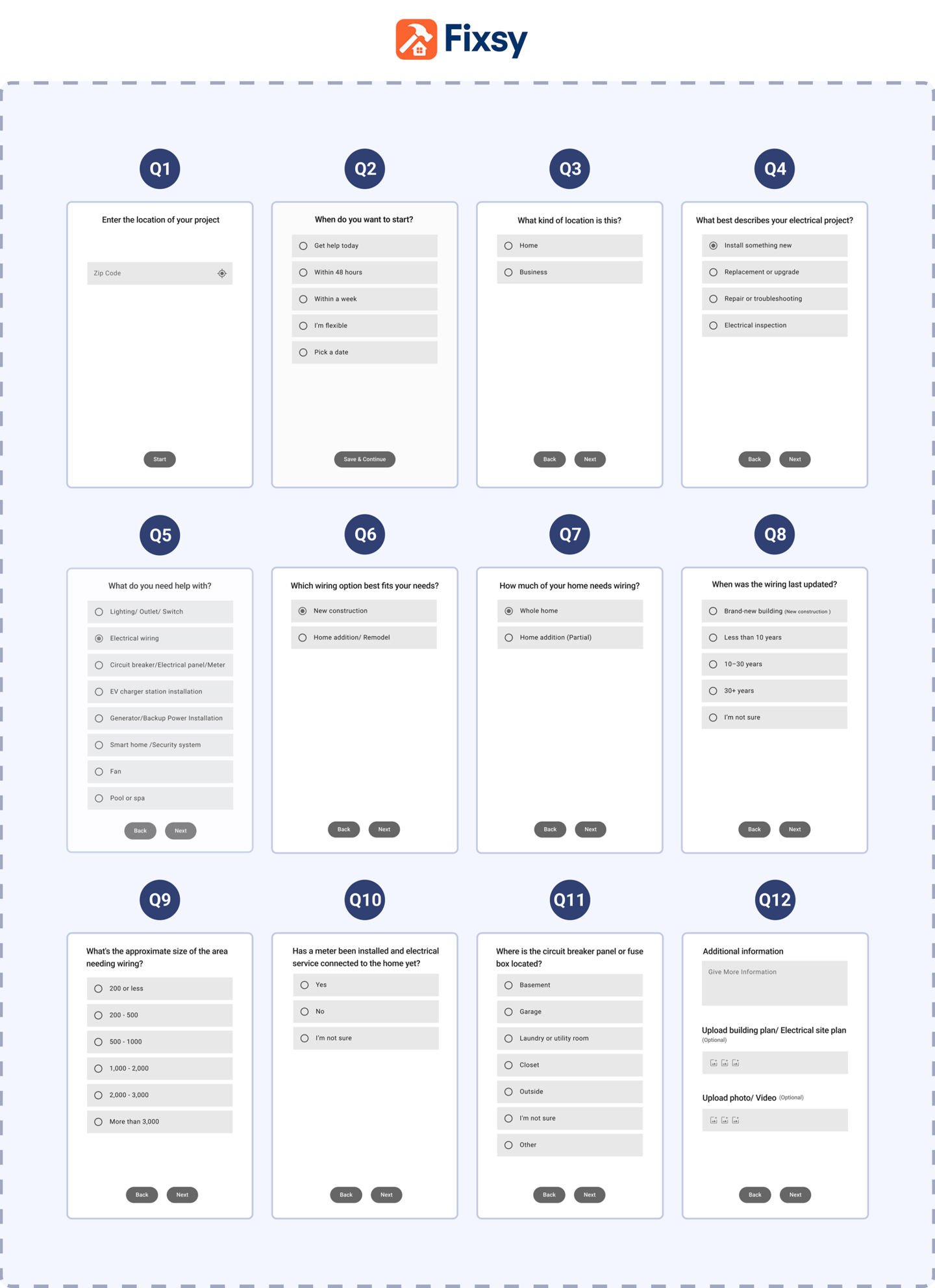
We tested this version with five users to identify pain points in the questionnaire.
Usability Testing Insights (Questionnaire Issues)
Length & Repetition:
Most users complained that the questionnaire felt too long, with several questions appearing repetitive.
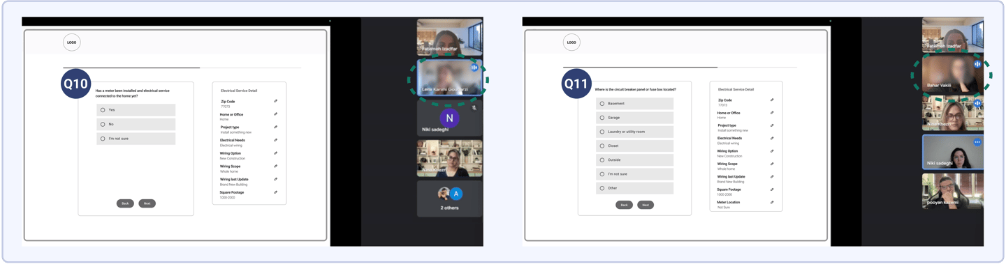
Unclear Questions (Q10 & Q11):
Many users selected “I’m not sure” for Questions 10 and 11, indicating that these questions were outside their knowledge.
Questionnaire Refinement
We asked the same three service providers to review the questionnaire again—this time based on user feedback. They were asked to identify which questions directly impact time and cost estimation (a key value proposition of Fixsy) and influence their decision-making when accepting jobs. They also suggested which questions could be merged or removed to streamline the process for users.
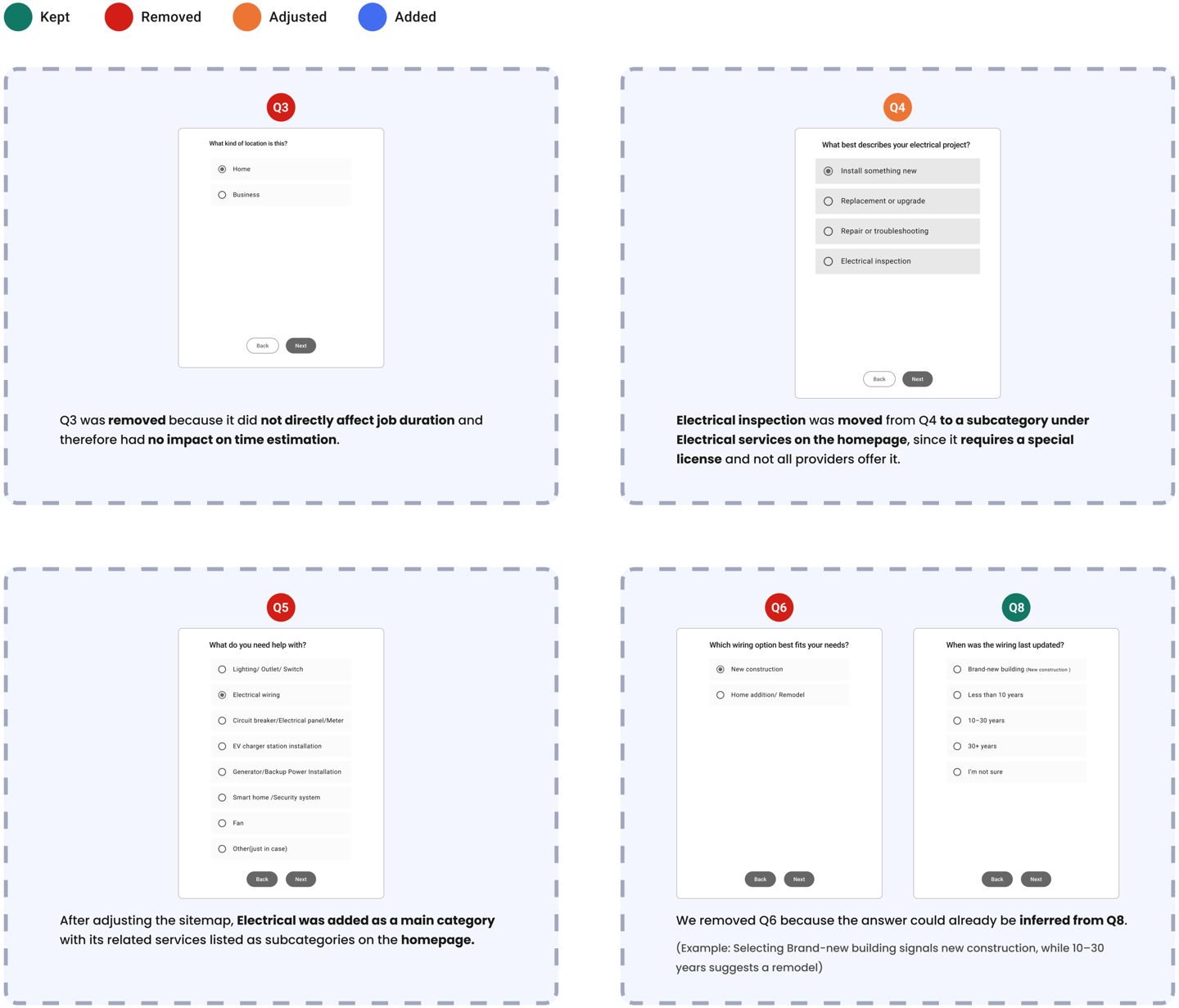
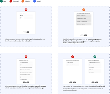

Questions 1–2 were removed from the questionnaire because they applied to both users who used the estimate option and those who didn’t, and they weren’t part of the estimation process itself.
These questions were only used to filter providers based on availability and are now presented as a separate overlay step before the questionnaire begins.
After several iterations & rounds of feedback from both users & service providers, we created
the updated version of the questionnaire shown below.


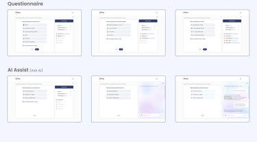
AI-Powered Guidance (Early Concept for User Support)
1. Usability Challenge Identified
During testing and research, we observed that some users struggled to answer certain questions confidently, leading to two key issues :
some abandoned the process out of frustration, others gave incorrect answers, leading to poor estimates, mismatched providers, and reduced trust
2. Value Insight: Why It Matters
The issue was documented and the findings were shared with stakeholders and the business team. It was noted that, while short-term costs may increase, accurate estimates and better provider matches help build long-term customer trust.
3. AI Assistant Proposal
After reviewing the report, the business team proposed adding an AI assistant to support users during the form process. Stakeholders approved exploring it as a feature.

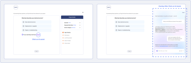
AI Assistant Interaction
The “Ask AI” option appears only for questions where users might need help finding the answer, not for all questions, to avoid overwhelming the interface and ensure support is targeted. This approach also helps manage platform resources by limiting unnecessary AI usage, making it more sustainable from both a technical and financial perspective.

Note: At this stage, the AI assistant is a conceptual design, not a fully developed AI product. Since the business is still early stage, it doesn’t yet have the large scale data typically needed to train a real AI model.
Our task was to sketch the AI assistant experience as a forward looking feature that aligns with the long term growth and scalability of the platform.
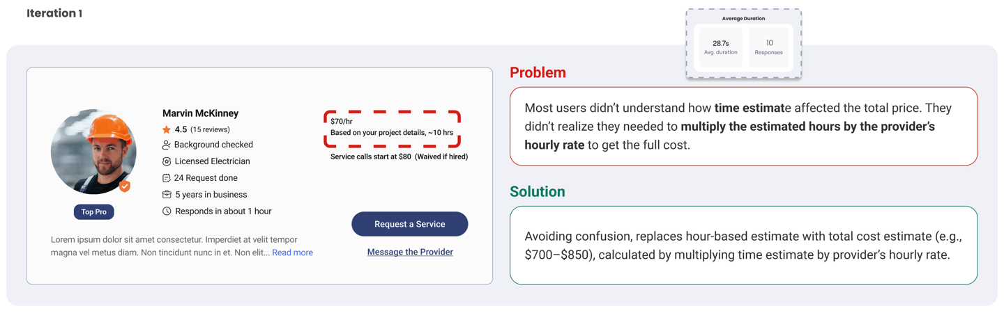
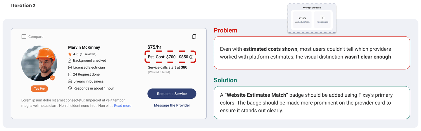
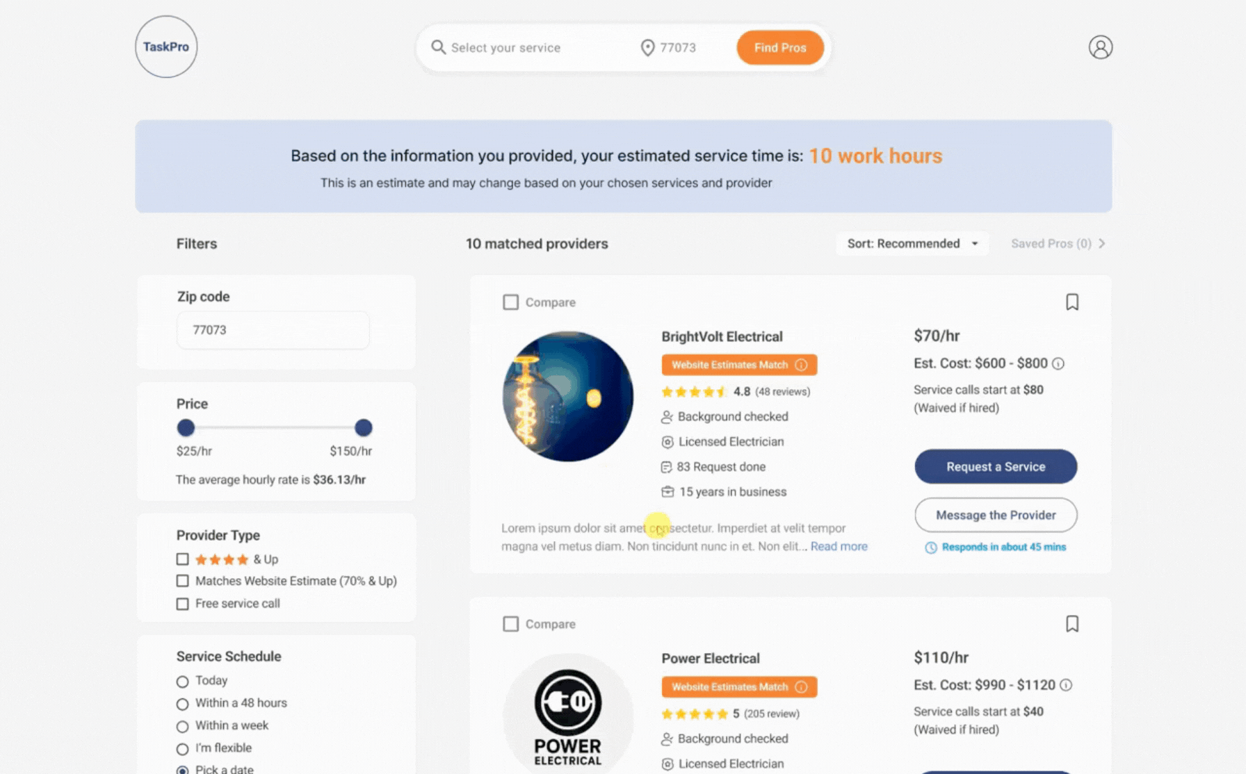
Providers Card Iterations
We designed the first version of the provider cards based on insights from the card sorting activity, which informed our initial information structure. Since time estimation is a key value proposition for Fixsy, we asked 10 users to browse a list of provider cards across three different designs to evaluate which best communicated the estimated time.
We refined the cards through three iterations based on user feedback
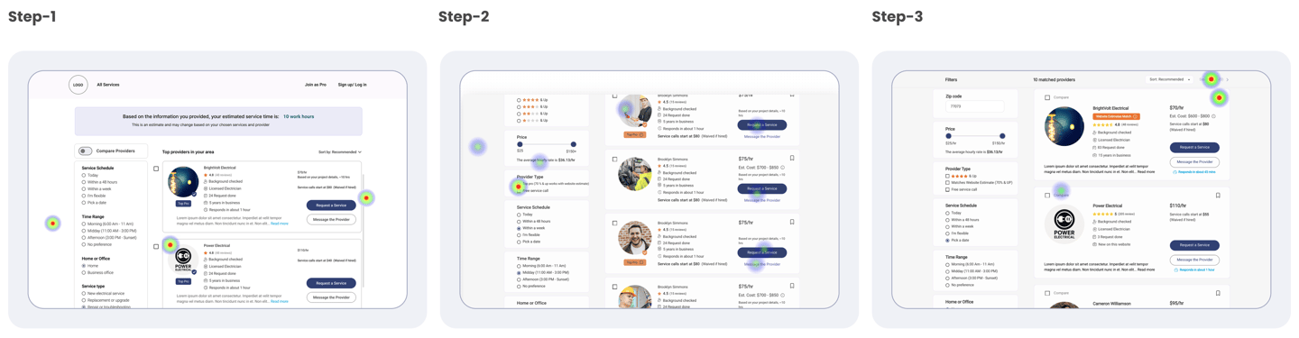
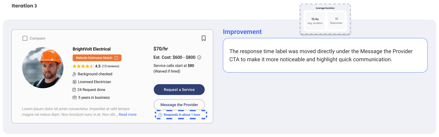
Outcome
Through three rounds of iteration, average task completion time dropped from 28.27s to 15.4s, a 45.5% improvement in speed. This reflects enhanced clarity, stronger trust signals, & faster decision making for users.
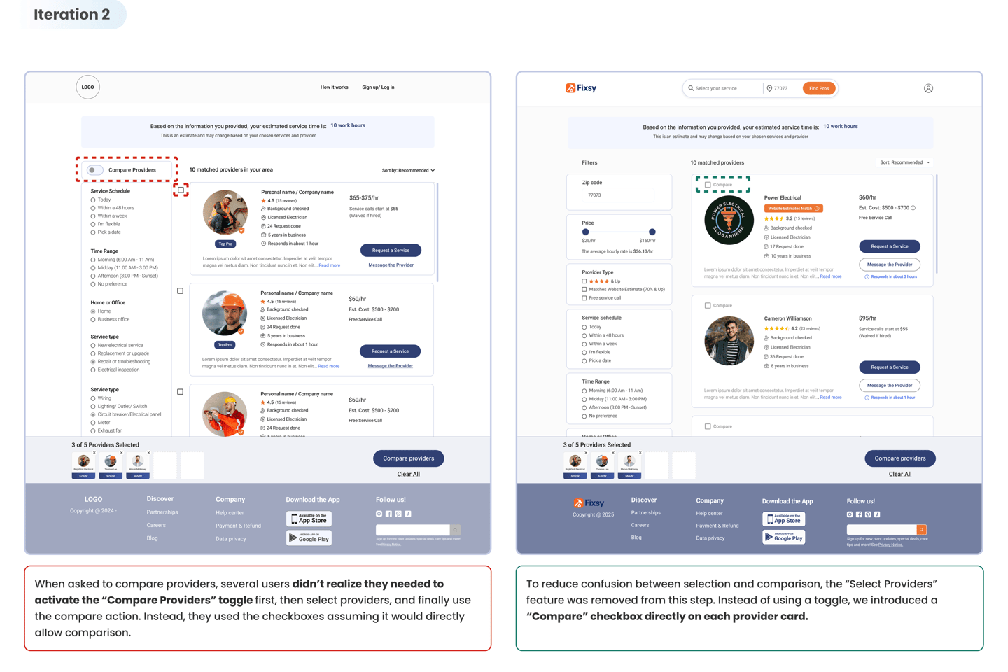
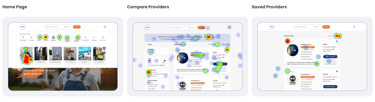
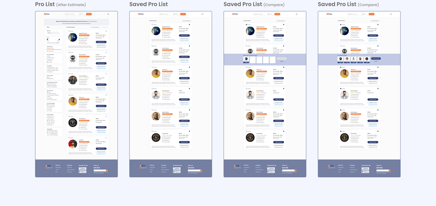
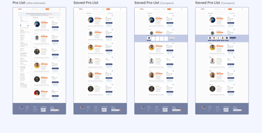
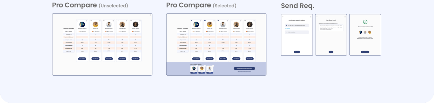
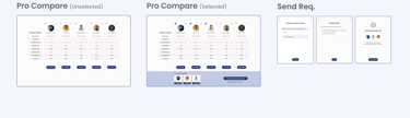
Compare Providers Feature
Test Scenario
We asked users to select and compare 5 providers.
Save Provider (A Suggested Feature for Future Growth)
This feature is intended for a later stage, when the number of providers on the platform increases. While not needed now, it anticipates a future where users may need to browse through many options. Save Provider allows users to bookmark profiles while browsing, helping them keep track and later choose up to 5 for comparison. (Optional — users can still compare without saving.)


Final Usability Testing (Flow Test )
To validate the final design, we conducted unmoderated usability testing using Maze, covering 7 core booking tasks with 15 participants per task:
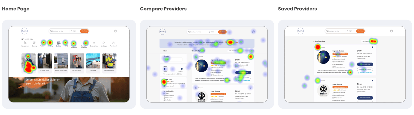
Key Insights
Task Completion Rate: More than 80% for key flows like service selection and provider comparison
Instruction Clarity Issues: 24% average drop-off rate and a 40% average mis click rate were mostly due to long task descriptions, not UX/UI confusion
Average Task Time: Varied from 40 seconds to 3 minutes, depending on task complexity
Success Clarity: Tasks like saving providers and selecting based on hourly rate showed consistent success
Navigation Patterns: Heatmaps showed strong reliance on visual cards and icons for guidance
High-Fidelity Prototype

What Did We Learn?
Analyzing leading platforms revealed strengths and gaps that guided smarter, user-focused design decisions.
Balancing user needs & stakeholder marketing strategies to shape a strategic, user-centric design approach
Designing interactions between homeowners and providers was essential for creating a balanced platform.
Improved communication with cross-functional team members and stakeholders for seamless idea exchange
What Can We Do Next
Validate Iterations
The results confirmed our design iterations were effective. While no major changes were needed, we plan to use these insights in the next design cycle to further optimize UI clarity and the overall user experience.Create the Dashboard Case Study
Begin documenting and analyzing the provider and homeowner dashboard experience as a separate case study to complete the full service journey.Complete Application Design
Finalize the remaining screens and flows for the Fixsy mobile app, ensuring consistency and accessibility across platforms.